

In Tailwind CSS, you can style an element based on the state of its previous sibling by using the peer marker. What you need to do is to add the peer class to that sibling, then use the peer-{modifier} prefix to style the element. {modifier} can be hover, focus, required, disabled, active, visited, checked, etc.
Words might be boring and confusing. Let’s see the example below for more clarity.
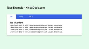
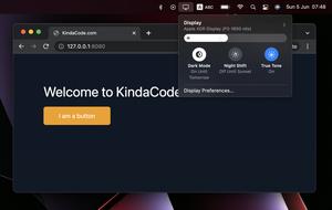
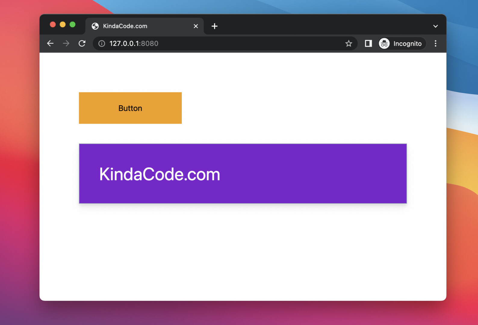
Example Preview
In this example, we have a button and a div that contains some text. When the user hovers over the button, the style of the div element will change (background color, text color, font size, drop shadow). Here’s how it works:
The complete code:
<!doctype html>
<html>

<head>
    <meta charset="UTF-8">
    <meta name="viewport" content="width=device-width, initial-scale=1.0">
    <script src="https://cdn.tailwindcss.com"></script>
    <title>KindaCode.com</title>
</head>

<body>
    <div class="p-20 space-y-10">
        <button class="px-20 py-5 bg-sky-300 hover:bg-amber-500 peer">Button</button>
        <div class="p-10 text-2xl
                    border border-slate-400
                    peer-hover:drop-shadow-lg
                    peer-hover:bg-purple-700
                    peer-hover:text-4xl
                    peer-hover:text-white
                    ease-in duration-300
                    ">
            KindaCode.com
        </div>
    </div>
</body>

</html>
That’s it. Further reading:
- Min-Width, Max-Width, Min-Height, and Max-Height in Tailwind CSS
- Tailwind CSS: How to Create a Responsive Layout
- Tailwind CSS: How to Create a Skewed Card
- Tailwind CSS: Create Buttons with Text and Icons Inside
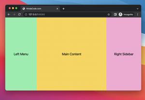
- How to Create a Fixed Sidebar with Tailwind CSS
- Tailwind CSS: Align a child element to the bottom of its parent
You can also check out our CSS category page for the latest tutorials and examples or go to Tailwind’s official website to learn more about the awesome framework.