If a user is viewing your website on a mobile phone or an Android tablet or an iPad, you can determine whether the device’s orientation is portrait or landscape using Tailwind CSS’s landscape and portrait modifiers. The concrete example below demonstrates how to do it.
Screenshots
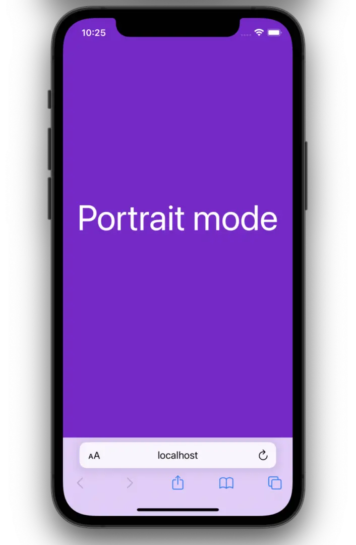
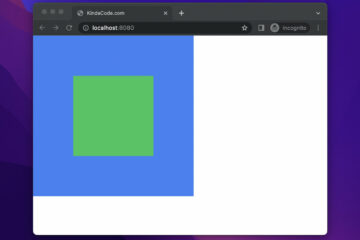
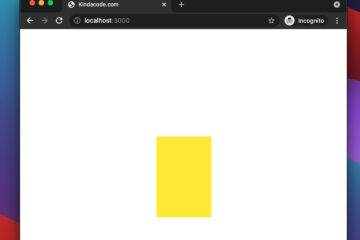
Portrait:
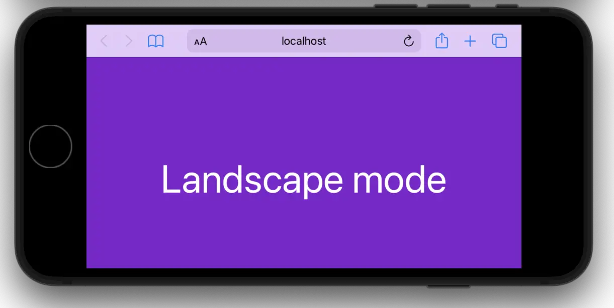
Landscape:
The code:
<body class="w-screen h-screen flex justify-center items-center bg-purple-700">
    <!-- This heading is hidden in portrait mode and only be shown in landscape mode-->
   <h1 class="portrait:hidden text-6xl text-white">Landscape mode</h1>

   <!-- This heading is hidden in landscape mode and only be shown in protrait mode -->
   <h1 class="landscape:hidden text-6xl text-white">Portrait mode</h1>
</body>
That’s it. Further reading:
- Tailwind CSS: How to create accordions (collapsible content)
- Form Validation with Tailwind CSS (without Javascript)
- Tailwind CSS: How to use calc() function
- Min-Width, Max-Width, Min-Height, and Max-Height in Tailwind CSS
- Tailwind CSS: Create a Search Field with an Icon Inside
- Tailwind CSS: Styling Hover, Active, and Visited Links
You can also check out our CSS category page for the latest tutorials and examples.

Note that you can mix viewport width selector with orientation selector, e.g.,