
This article shows you how to make loading indicators with only pure Tailwind CSS. There is no need to use SVGs, GIFs, or any kinds of icons. The most important point is that in Tailwind CSS, we can make an element spin around using the animate-spin utility class.
Example
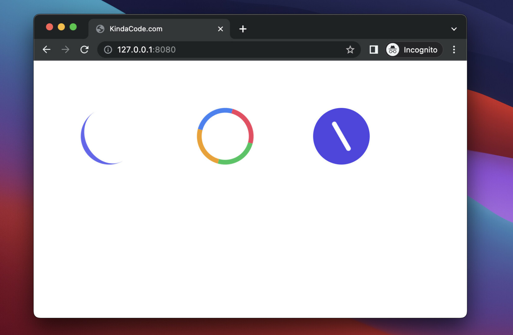
This example displays three different styles of circular loading indicator.
Preview:
The code:
<body class="p-20 grid grid-cols-3 gap-4">

    <div class="inline-block w-24 h-24
            border-t-8
            border-t-indigo-500
            rounded-full
            animate-spin"></div>

    <div class="inline-block w-24 h-24
            border-8
            border-t-amber-500
            border-r-blue-500
            border-b-rose-500
            border-l-green-500
            rounded-full
            animate-spin"></div>

    <div class="w-24 h-24 p-5 bg-indigo-600 rounded-full flex items-center justify-center">
        <div class="w-24 h-2 bg-white animate-spin rounded-lg"></div>
    </div>
</body>
That’s it. Further reading:
- How to Style File Inputs with Tailwind CSS
- Tailwind CSS: Create a User Card with Circle Avatar
- How to Create Frosted Glass Effect in Tailwind CSS
- How to Create a Fixed Sidebar with Tailwind CSS
- How to create cut-out text effect with Tailwind CSS
- How to Add Drop Shadows in Tailwind CSS
You can also check out our CSS category page for the latest tutorials and examples.