


In Tailwind CSS, You can combine the file modifier (a modifier is just a prefix that can be added to the beginning of a class) with other utility classes to create a custom beautiful file input, such as file:bg-amber-500, file:text-sm, etc.
You can also style your file input button when the mouse is hovering over it by using the hover modifier, like this: hover:file:text-amber-700, hover:file:bg-rose-500, etc.
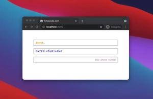
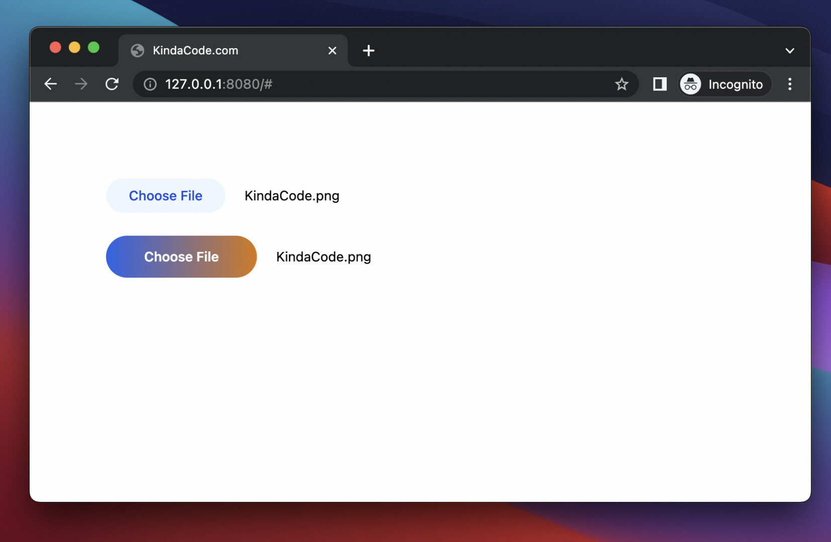
For more clarity, please see the example below.
Preview:
The code:
<body class="p-20">
    <form>
        <!-- the first file input -->
        <label>
            <input type="file" class="text-sm text-grey-500
            file:mr-5 file:py-2 file:px-6
            file:rounded-full file:border-0
            file:text-sm file:font-medium
            file:bg-blue-50 file:text-blue-700
            hover:file:cursor-pointer hover:file:bg-amber-50
            hover:file:text-amber-700
          " />
        </label>
        <div class="h-6"></div> <!-- just add some space -->

        <!-- the second file input -->
        <label>
            <input type="file" class="text-sm text-grey-500
            file:mr-5 file:py-3 file:px-10
            file:rounded-full file:border-0
            file:text-md file:font-semibold  file:text-white
            file:bg-gradient-to-r file:from-blue-600 file:to-amber-600
            hover:file:cursor-pointer hover:file:opacity-80
          " />
        </label>
    </form>
</body>
That’s it. Further reading:
- Text Underline in Tailwind CSS
- Tailwind CSS: Create a User Card with Circle Avatar
- How to Create Frosted Glass Effect in Tailwind CSS
- How to Create a Fixed Sidebar with Tailwind CSS
- How to Change Mouse Cursor in Tailwind CSS
- Tailwind CSS: How to Create Columns with the Same Height
You can also check out our CSS category page for the latest tutorials and examples.