

The example below shows you how to create a full-height fixed sidebar with Tailwind CSS.
We will be using fixed and top-0 (optional) and left-0 (optional) utility classes for the sidebar. Besides, in order to prevent the content area from being obscured by the sidebar, we must give this content area the margin-left equal to the width of the sidebar.
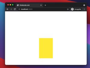
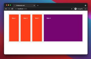
Example preview:
Note: If you’re using Safari, this demo video might not work nicely or not start at all. Please use Chrome, Edge, Firefox, or another web browser instead.
The code:
<body>
    <div class="flex">
        <aside class="w-44 fixed left-0 top-0 h-screen bg-slate-700 p-10">
            <h1 class="text-white text-4xl">Sidebar</h1>
        </aside>
        <main class="flex-1 ml-44">
            <div class="h-96 bg-amber-400 p-10">
                <h1 class="text-4xl">Top Content</h1>
            </div>
            <div class="h-96 bg-white p-10">
                <h1 class="text-4xl">Middle Content</h1>
            </div>
            <div class="h-96 bg-green-400 p-10">
                <h1 class="text-4xl">Middle Content</h1>
            </div>
            <div class="h-96 bg-indigo-400 p-10">
                <h1 class="text-4xl">Last Content</h1>
            </div>
        </main>
    </div>
</body>
That’s it. Further reading:
- How to Style Placeholder Text with Tailwind CSS
- Tailwind CSS: How to Create a Sticky/Affix NavBar
- Tailwind CSS: Make a Div 100% Height & Width of the Viewport
- How to create cut-out text effect with Tailwind CSS
- How to Create Circle Buttons with Tailwind CSS
- Most Popular Open-Souce CSS Frameworks
You can also check out our CSS category page for the latest tutorials and examples.