

This quick article shows you a couple of different ways to create an icon button with a border in Flutter.
Using IconButton and Container
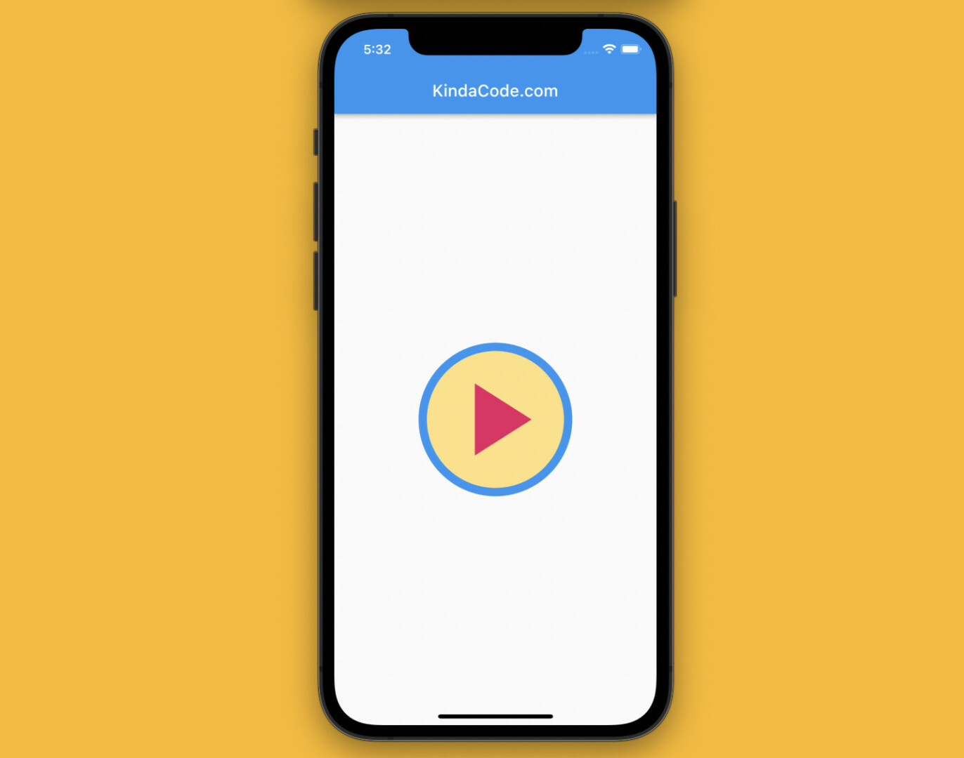
What you need to do is simply wrap an IconButton widget within a circle Container widget and add a border to this Container by using BoxDecoration.
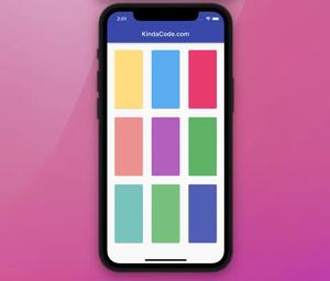
Screenshot:
The code:
Scaffold(
      appBar: AppBar(title: const Text('KindaCode.com')),
      body: Center(
        child: Container(
          decoration: BoxDecoration(
            border: Border.all(width: 10, color: Colors.blue),
            color: Colors.amber.shade200,
            shape: BoxShape.circle,
          ),
          child: IconButton(
            iconSize: 150,
            icon: const Icon(
              Icons.play_arrow,
              color: Colors.pink,
            ),
            onPressed: () {
              print('Hi There');
            },
          ),
        ),
      ),
);
Using Material, Ink, and InkWell widgets
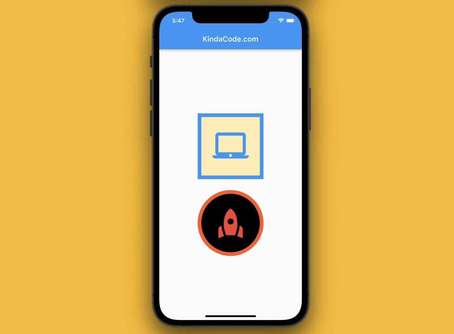
You can also use a combination of a Material widget, an Ink widget, and an InkWell widget to create an icon button with a border. The flash/ripple effect will be maintained. The example below produces 2 icon buttons with this technique.
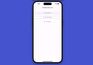
Screenshot:
The code:
Scaffold(
      appBar: AppBar(title: const Text('KindaCode.com')),
      body: Center(
        child: Column(
          mainAxisAlignment: MainAxisAlignment.center,
          children: [
            // square icon button
            Material(
              type: MaterialType.transparency,
              child: Ink(
                decoration: BoxDecoration(
                  // set the border
                  border: Border.all(width: 10, color: Colors.blue),
                  // background color
                  color: Colors.amber.shade100,
                ),
                child: InkWell(
                  onTap: () {
                    print("Hi");
                  },
                  child: const Padding(
                    padding: EdgeInsets.all(30.0),
                    child: Icon(
                      Icons.laptop_mac,
                      size: 100,
                      color: Colors.blue,
                    ),
                  ),
                ),
              ),
            ),
            const SizedBox(height: 30),

            // circular icon button
            Material(
              type: MaterialType.transparency,
              child: Ink(
                decoration: BoxDecoration(
                  // set the border
                  border: Border.all(width: 10, color: Colors.deepOrange),
                  // border radius
                  borderRadius: BorderRadius.circular(100),
                  // background color
                  color: Colors.black,
                ),
                child: InkWell(
                  borderRadius: BorderRadius.circular(100.0),
                  onTap: () {
                    print("Hello");
                  },
                  child: const Padding(
                    padding: EdgeInsets.all(30.0),
                    child: Icon(
                      Icons.rocket,
                      size: 100,
                      color: Colors.red,
                    ),
                  ),
                ),
              ),
            ),
          ],
        ),
      ),
);
That’s it. Further reading:
- Flutter: Get the Position of a Tap (X & Y coordinates)
- Flutter: Creating a Fullscreen Modal with Search Form
- Flutter: Showing a Context Menu on Long Press
- Flutter + Firebase Storage: Upload, Retrieve, and Delete files
- Flutter and Firestore Database: CRUD example
- Flutter StreamBuilder examples (null safety)
You can also tour around our Flutter topic page or Dart topic page for the most recent tutorials and examples.


