


This practical and straightforward article walks you through 4 different ways to create full-width buttons in Flutter.
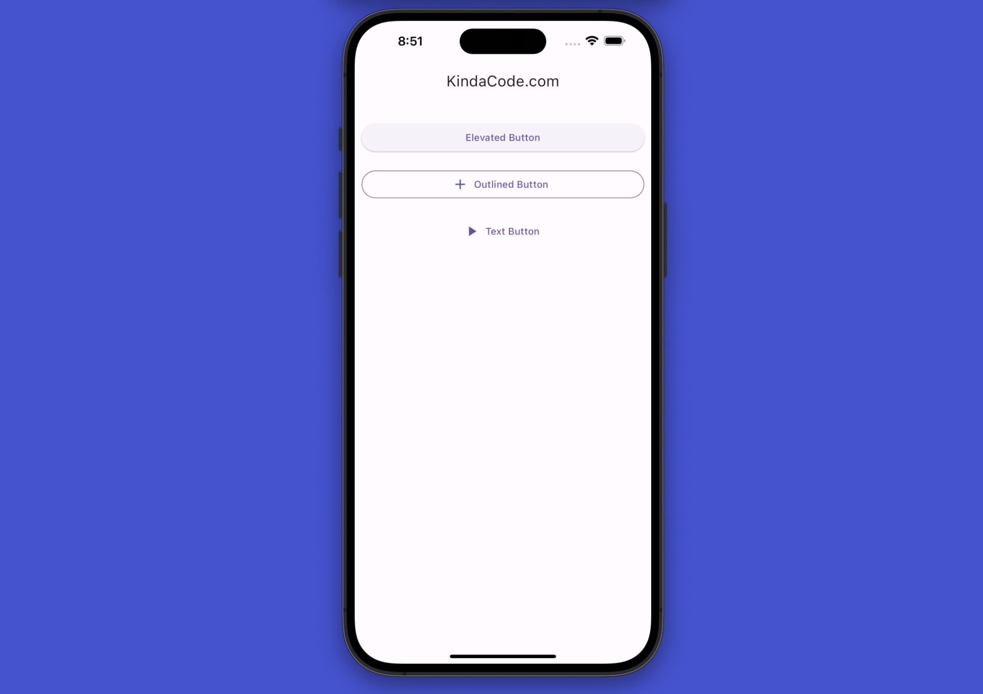
Using ElevatedButton + Container/SizedBox
Wrap your ElevatedButton (or TextButton, OutlinedButton) widget inside a Container or a SizedBox whose width is set to double.infinity.
Example (with useMaterial3 is enable):
The code:
// kindacode.com
// main.dart
import 'package:flutter/material.dart';
void main() {
runApp(const MyApp());
}
class MyApp extends StatelessWidget {
const MyApp({Key? key}) : super(key: key);
@override
Widget build(BuildContext context) {
return MaterialApp(
// Remove the debug banner
debugShowCheckedModeBanner: false,
title: 'KindaCode.com',
theme: ThemeData(
useMaterial3: true,
),
home: const KindaCodeDemo(),
);
}
}
class KindaCodeDemo extends StatelessWidget {
const KindaCodeDemo({Key? key}) : super(key: key);
@override
Widget build(BuildContext context) {
return Scaffold(
appBar: AppBar(title: const Text('KindaCode.com')),
body: Padding(
padding: const EdgeInsets.symmetric(vertical: 30, horizontal: 10),
child: Column(
children: [
// Full width button 1
SizedBox(
width: double.infinity,
child: ElevatedButton(
onPressed: () {}, child: const Text('Elevated Button'))),
const SizedBox(
height: 20,
),
// Full width button 2
Container(
width: double.infinity,
color: Colors.transparent,
child: OutlinedButton.icon(
onPressed: () {},
icon: const Icon(Icons.add),
label: const Text('Outlined Button')),
),
const SizedBox(
height: 20,
),
// Full width button 3
SizedBox(
width: double.infinity,
child: TextButton.icon(
onPressed: () {},
icon: const Icon(Icons.play_arrow),
label: const Text('Text Button')),
),
],
),
),
);
}
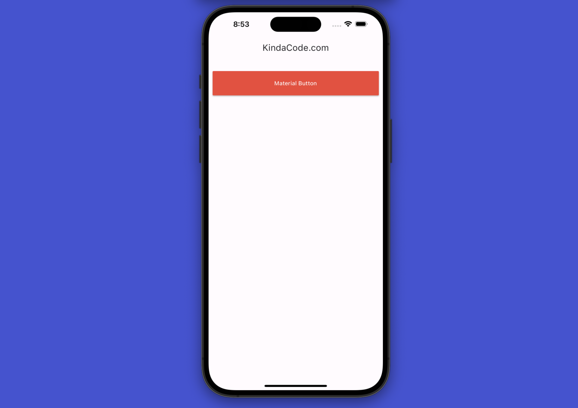
}Using MaterialButton
You can simply implement a full-width button with the MaterialButton widget by setting its minWidth property to double.infinity.
Example (with useMaterial3 is enabled):
The code:
Scaffold(
appBar: AppBar(title: const Text('KindaCode.com')),
body: Padding(
padding: const EdgeInsets.symmetric(vertical: 30, horizontal: 10),
child: Column(
children: [
MaterialButton(
minWidth: double.infinity,
height: 60,
color: Colors.red,
textColor: Colors.white,
onPressed: () {},
child: const Text('Material Button')),
],
),
),
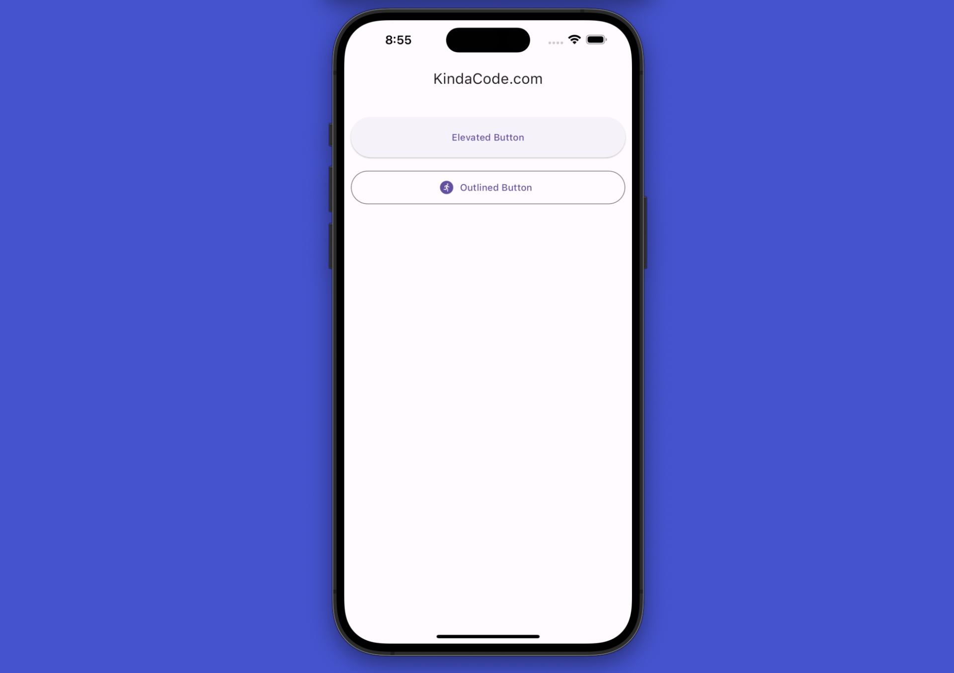
);Setting minimumSize for ElevatedButton/TextButton
If you style your ElevatedButton (or TextButton, OutlinedButton) with the styleFrom() static method, you can make its width match the parent width by setting the minimumSize parameter to Size.fromHeight(x), where x is the height of the button.
Example (with Material 3):
The code:
Scaffold(
appBar: AppBar(title: const Text('KindaCode.com')),
body: Padding(
padding: const EdgeInsets.symmetric(vertical: 30, horizontal: 10),
child: Column(
children: [
ElevatedButton(
style: ElevatedButton.styleFrom(
// The width will be 100% of the parent widget
// The height will be 60
minimumSize: const Size.fromHeight(60)),
onPressed: () {},
child: const Text('Elevated Button')),
const SizedBox(height: 20),
OutlinedButton.icon(
style: OutlinedButton.styleFrom(
// the height is 50, the width is full
minimumSize: const Size.fromHeight(50)),
onPressed: () {},
icon: const Icon(Icons.run_circle),
label: const Text('Outlined Button')),
],
),
),
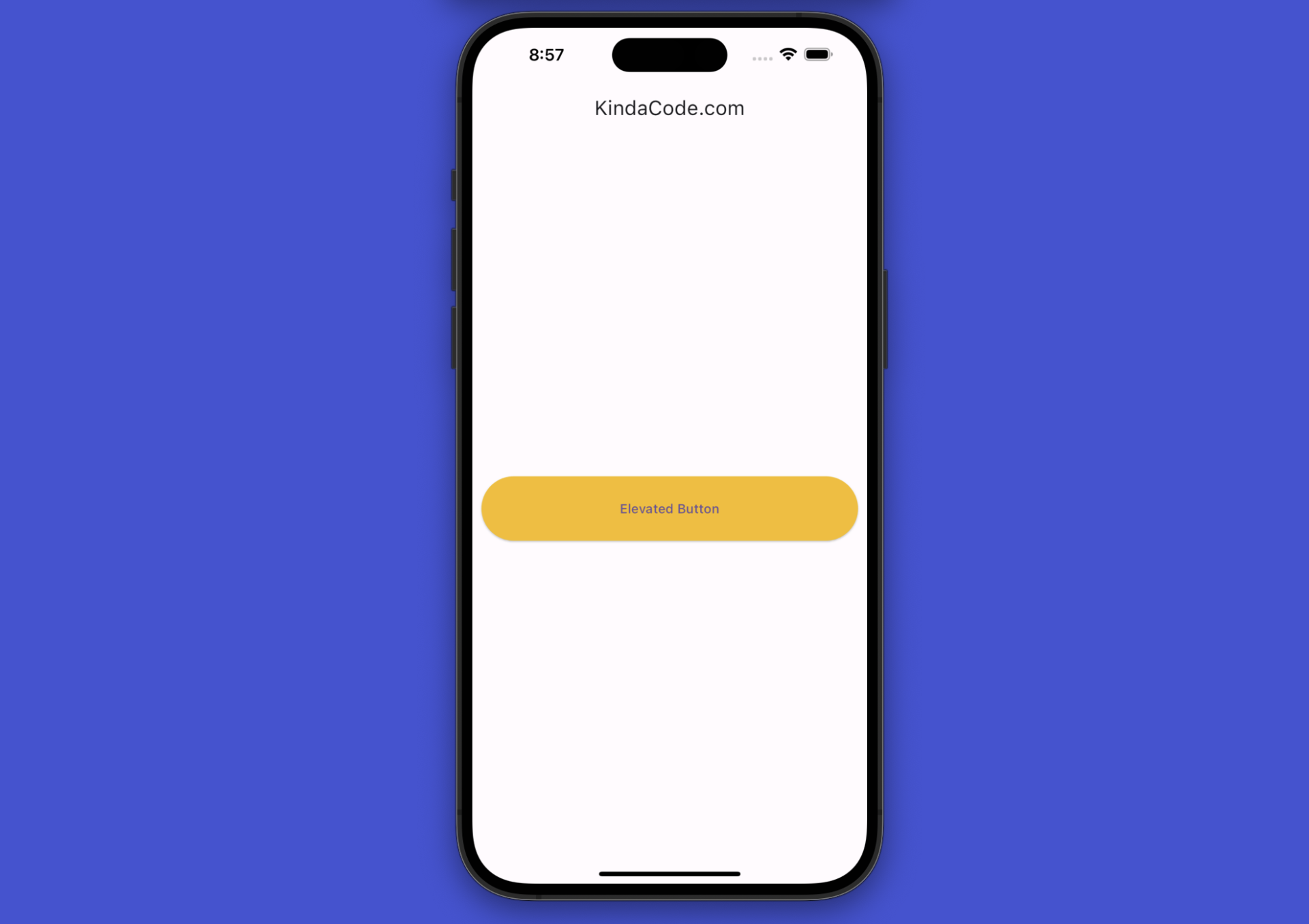
);Using ConstrainedBox
Example:
Scaffold(
      appBar: AppBar(title: const Text('KindaCode.com')),
      body: Padding(
        padding: const EdgeInsets.symmetric(vertical: 30, horizontal: 10),
        child: Center(
          child: ConstrainedBox(
              constraints: const BoxConstraints(
                  minWidth: double.infinity, minHeight: 70),
              child: ElevatedButton(
                onPressed: () {},
                style: ElevatedButton.styleFrom(backgroundColor: Colors.amber),
                child: const Text('Elevated Button'),
              )),
        ),
      ),
    );
Screenshot:
Wrapping Up
We’ve covered a bunch of techniques to create full-width buttons in Flutter. Choose from them the one you like the most and go with it.
Flutter is fantastic and rapidly evolving. Continue exploring more new and exciting things by taking a look at the following articles:
- Hero Widget in Flutter: A Practical Guide
- Flutter AnimatedList – Tutorial and Examples
- Flutter Cupertino Button – Tutorial and Examples
- Working with ElevatedButton in Flutter (updated)
- Flutter: 2 Ways to Create Gradient Background Buttons
- Using GetX (Get) for State Management in Flutter
You can also check out our Flutter category page or Dart category page for the latest tutorials and examples.