


This article shows you how to create an adaptive layout in Flutter by using both NavigationRail and BottomNavigationBar. We’ll have a glance at the concept and then walk through a complete example of applying that concept in practice.
Overview
The NavigationRail widget is used to create a “vertical tab bar” that resides at the left or right of an app. It’s highly fit for wide-screen devices like tablets, laptops, TVs. It typically contains multiple items that let the user easily switch between different views.
The BottomNavigationBar widget is used to create a bottom tab bar that is perfect for smartphones. It consists of multiple tabs that let the user easily navigate between views.
See also: Working with Cupertino Bottom Tab Bar in Flutter
We can use NavigationRail along with BottomNavigationBar to build a modern adaptive layout. When the screen size is large, we display NavigationRail, and when the screen is small, we show BottomNavigationBar. Only one of them appears at a time. To detect the screen width, we can use:
MediaQuery.of(context).size.widthThe Example
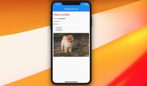
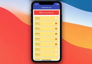
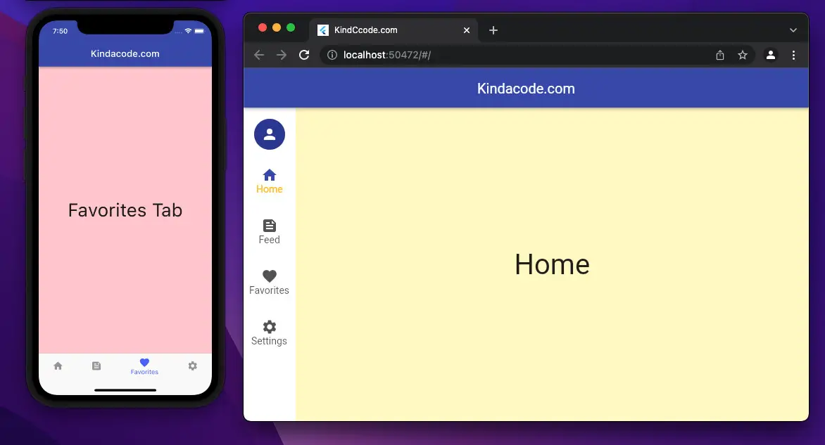
App Preview
The app we’re going to build has a navigation rail, a bottom tab bar, and 4 different views: Home, Feed, Favorites, and Settings. Each view is connected with a tab of the bottom tab bar and an item of the navigation rail.
- If the screen width is less than 640 pixels, the bottom tab bar will be rendered while the left navigation rail won’t be shown.
- If the screen width is equal to or greater than 640 pixels, the bottom tab bar won’t be rendered while the left navigation rail will show up.
Here’s how it works:
The Code
Here’s the complete code (with explanations) that produces the app above:
// main.dart
import 'package:flutter/material.dart';

void main() {
  runApp(const MyApp());
}

class MyApp extends StatelessWidget {
  const MyApp({Key? key}) : super(key: key);
  @override
  Widget build(BuildContext context) {
    return MaterialApp(
        // Remove the debug banner
        debugShowCheckedModeBanner: false,
        title: 'KindCcode.com',
        theme: ThemeData(primarySwatch: Colors.indigo),
        home: const HomeScreen());
  }
}

class HomeScreen extends StatefulWidget {
  const HomeScreen({Key? key}) : super(key: key);

  @override
  State<HomeScreen> createState() => _HomeScreenState();
}

class _HomeScreenState extends State<HomeScreen> {
  // The contents of views
  // Only the content associated with the selected tab is displayed on the screen
  final List<Widget> _mainContents = [
    // Content for Home tab
    Container(
      color: Colors.yellow.shade100,
      alignment: Alignment.center,
      child: const Text(
        'Home',
        style: TextStyle(fontSize: 40),
      ),
    ),
    // Content for Feed tab
    Container(
      color: Colors.purple.shade100,
      alignment: Alignment.center,
      child: const Text(
        'Feed',
        style: TextStyle(fontSize: 40),
      ),
    ),
    // Content for Favorites tab
    Container(
      color: Colors.red.shade100,
      alignment: Alignment.center,
      child: const Text(
        'Favorites',
        style: TextStyle(fontSize: 40),
      ),
    ),
    // Content for Settings tab
    Container(
      color: Colors.pink.shade300,
      alignment: Alignment.center,
      child: const Text(
        'Settings',
        style: TextStyle(fontSize: 40),
      ),
    )
  ];

  // The index of the selected tab
  // In the beginning, the Home tab is selected
  int _selectedIndex = 0;

  @override
  Widget build(BuildContext context) {
    return Scaffold(
      appBar: AppBar(
        title: const Text('Kindacode.com'),
      ),
      // Show the bottom tab bar if screen width < 640
      bottomNavigationBar: MediaQuery.of(context).size.width < 640
          ? BottomNavigationBar(
              currentIndex: _selectedIndex,
              unselectedItemColor: Colors.grey,
              selectedItemColor: Colors.indigoAccent,
              // called when one tab is selected
              onTap: (int index) {
                setState(() {
                  _selectedIndex = index;
                });
              },
              // bottom tab items
              items: const [
                  BottomNavigationBarItem(
                      icon: Icon(Icons.home), label: 'Home'),
                  BottomNavigationBarItem(
                      icon: Icon(Icons.feed), label: 'Feed'),
                  BottomNavigationBarItem(
                      icon: Icon(Icons.favorite), label: 'Favorites'),
                  BottomNavigationBarItem(
                      icon: Icon(Icons.settings), label: 'Settings')
                ])
          : null,
      body: Row(
        mainAxisSize: MainAxisSize.max,
        children: [
          // Show the navigaiton rail if screen width >= 640
          if (MediaQuery.of(context).size.width >= 640)
            NavigationRail(
              minWidth: 55.0,
              selectedIndex: _selectedIndex,
              // Called when one tab is selected
              onDestinationSelected: (int index) {
                setState(() {
                  _selectedIndex = index;
                });
              },
              labelType: NavigationRailLabelType.all,
              selectedLabelTextStyle: const TextStyle(
                color: Colors.amber,
              ),
              leading: Column(
                children: const [
                  SizedBox(
                    height: 8,
                  ),
                  CircleAvatar(
                    radius: 20,
                    child: Icon(Icons.person),
                  ),
                ],
              ),
              unselectedLabelTextStyle: const TextStyle(),
              // navigation rail items
              destinations: const [
                NavigationRailDestination(
                    icon: Icon(Icons.home), label: Text('Home')),
                NavigationRailDestination(
                    icon: Icon(Icons.feed), label: Text('Feed')),
                NavigationRailDestination(
                    icon: Icon(Icons.favorite), label: Text('Favorites')),
                NavigationRailDestination(
                    icon: Icon(Icons.settings), label: Text('Settings')),
              ],
            ),

          // Main content
          // This part is always shown
          // You will see it on both small and wide screen
          Expanded(child: _mainContents[_selectedIndex]),
        ],
      ),
    );
  }
}
Constructors & References
NavigationRail constructor:
NavigationRail({
  Key? key,
  Color? backgroundColor,
  bool extended = false,
  Widget? leading,
  Widget? trailing,
  required List<NavigationRailDestination> destinations,
  required int selectedIndex,
  ValueChanged<int>? onDestinationSelected,
  double? elevation,
  double? groupAlignment,
  NavigationRailLabelType? labelType,
  TextStyle? unselectedLabelTextStyle,
  TextStyle? selectedLabelTextStyle,
  IconThemeData? unselectedIconTheme,
  IconThemeData? selectedIconTheme,
  double? minWidth,
  double? minExtendedWidth,
  bool? useIndicator,
  Color? indicatorColor
})
BottomNavigationBar constructor:
BottomNavigationBar({
  Key? key,
  required List<BottomNavigationBarItem> items,
  ValueChanged<int>? onTap,
  int currentIndex = 0,
  double? elevation,
  BottomNavigationBarType? type,
  Color? fixedColor,
  Color? backgroundColor,
  double iconSize = 24.0,
  Color? selectedItemColor,
  Color? unselectedItemColor,
  IconThemeData? selectedIconTheme,
  IconThemeData? unselectedIconTheme,
  double selectedFontSize = 14.0,
  double unselectedFontSize = 12.0,
  TextStyle? selectedLabelStyle,
  TextStyle? unselectedLabelStyle,
  bool? showSelectedLabels,
  bool? showUnselectedLabels,
  MouseCursor? mouseCursor,
  bool? enableFeedback,
  BottomNavigationBarLandscapeLayout? landscapeLayout
})
References:
- Navigation rail: Design (material.io)
- NavigationRail class (flutter.dev)
- NavigationRailDestination class (flutter.dev)
- BottomNavigationBar class (flutter.dev)
Afterword
You’ve learned a simple but effective technique to create a modern adaptive user interface by using NavigationRail and BottomNavigationBar. With this knowledge in mind, you can build more intuitive and engaging apps for a wide range of devices, from smartphones to tablets and laptops. As a result, your apps will gain more and more users and have a higher chance to success.
Flutter is amazing, and there are a lot of things to learn. Keep the ball rolling and moving forward by taking a look at the following articles:
- Flutter & Hive Database: CRUD Example
- Flutter: SliverGrid example
- Flutter AnimatedList – Tutorial and Examples
- Flutter + Firebase Storage: Upload, Retrieve, and Delete files
- How to make an image carousel in Flutter
- How to implement Star Rating in Flutter
You can also check out our Flutter category page or Dart category page for the latest tutorials and examples.


