


There are cases where you will want an icon that can change its own appearance like a play/pause button for a video or audio, a button to close/open a menu, etc. Luckily, you can achieve your goal with a few lines of code by using AnimatedIcon.
A Full Example
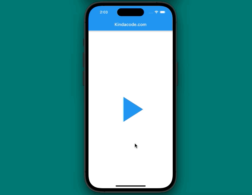
Preview:
This example demonstrates an animated play/pause button.
The full code:
// main.dart
import 'package:flutter/material.dart';

void main() {
  runApp(const MyApp());
}

class MyApp extends StatelessWidget {
  const MyApp({Key? key}) : super(key: key);

  @override
  Widget build(BuildContext context) {
    return const MaterialApp(
      debugShowCheckedModeBanner: false,
      title: 'Kindacode.com',
      home: HomePage(),
    );
  }
}

class HomePage extends StatefulWidget {
  const HomePage({Key? key}) : super(key: key);

  @override
  State<HomePage> createState() => _HomePageState();
}

class _HomePageState extends State<HomePage> with TickerProviderStateMixin {
  bool _isPlay = false;
  late AnimationController _controller;

  @override
  void initState() {
    _controller =
        AnimationController(duration: const Duration(seconds: 1), vsync: this);
    super.initState();
  }

  // Dispose the controller
  @override
  void dispose() {
    _controller.dispose();
    super.dispose();
  }

  @override
  Widget build(BuildContext context) {
    return Scaffold(
        appBar: AppBar(
          title: const Text('Kindacode.com'),
        ),
        body: Center(
          child: GestureDetector(
            onTap: () {
              if (_isPlay == false) {
                _controller.forward();
                _isPlay = true;
              } else {
                _controller.reverse();
                _isPlay = false;
              }
            },
            child: AnimatedIcon(
              icon: AnimatedIcons.play_pause,
              progress: _controller,
              size: 200,
              color: Colors.blue,
            ),
          ),
        ));
  }
}
Available Animated Icons & API
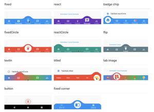
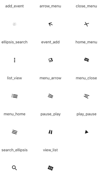
All Available Animated Icons
Currently, Flutter provides directly a set of 14 animated icons as shown below:
Constructor
AnimatedIcon({
   Key? key,
   required AnimatedIconData icon,
   required Animation<double> progress,
   Color? color,
   double? size,
   String? semanticLabel,
   TextDirection? textDirection
})
Parameters
The following table listed the most-used parameters of the AnimatedIcon widget:
| Parameter | Type | Description |
|---|---|---|
| icon (required) | AnimatedIconData | Determine the icon that will be displayed. |
| progress (required) | Animation<double> | The animation progress |
| color | Color | The color of the icon |
| size | double | Sizing the icon |
You can see other properties in the official docs.
Conclusion
We have walked through a complete example and the fundamental of the AnimatedIcon widget. At this point, you should get a better sense when using it in your applications to make more attractive user interfaces.
If you would like to explore more exciting things about Flutter, give a look at the following articles:
- Example of sortable DataTable in Flutter
- Flutter AnimatedList – Tutorial and Examples
- Flutter: AnimatedContainer example
- Flutter: Scrolling to the desired Item in a ListView
- How to use Cupertino icons in Flutter
- Example of CupertinoSliverNavigationBar in Flutter
You can also check out our Flutter topic page or Dart topic page for the latest tutorials and examples.