


In Tailwind CSS, you can style links differently based on what state they are in (hover, active, and visited) by using the following pseudo-class modifiers:
- hover: used for a link when the user mouse is over it (e.g., hover:text-red-500, hover:underline, etc)
- active: used to style a link at the moment it is clicked (e.g., active:font-bold, active:text-indigo-500, etc)
- visited: used for a link the user has visited (e.g, visited:text-purple-500, etc)
To style a normal, unvisited link, you don’t need a modifier.
For more clarity, see the example below.
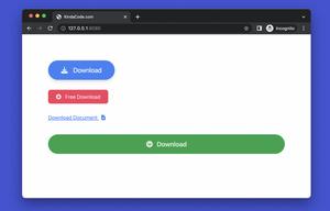
Example preview:
The code:
<body class="p-10">
    <p>
        <a class="text-lg text-blue-500
    hover:underline hover:text-red-500
    active:text-yellow-500 " href="https://www.kindacode.com">
            Text Link
        </a>
    </p>

    <p class="mt-10">
        <a class="px-5 py-3 bg-green-700 text-white cursor-pointer rounded-full
            hover:bg-green-500
            hover:text-yellow
            active:bg-amber-500
            "
        href="https://www.kindacode.com"
        >
            Button Link
        </a>
    </p>
</body>
You can learn more about Tailwind CSS in the official docs.
Further reading:
- Tailwind CSS: How to Create a Responsive Layout
- Tailwind CSS: How to Create Parallax Scrolling Effect
- Tailwind CSS: Creating Shimmer Loading Placeholder (Skeleton)
- Tailwind CSS: Align an element to the left/right of its parent
- Text Decoration in Tailwind CSS: The Complete Guide
- How to Create Striped Tables with Tailwind CSS
You can also check out our CSS category page for the latest tutorials and examples.