

This tutorial walks you through a complete example of creating a typical responsive navigation menu bar with logo, links, and a search box inside. We’ll use Tailwind CSS, Font Awesome (to add some icons), and a little vanilla Javascript (just a couple of code lines).
To integrate Font Awesome, add the following to the <head> section of your HTML page:
<link rel="stylesheet" href="https://cdnjs.cloudflare.com/ajax/libs/font-awesome/6.1.1/css/all.min.css" />If you’ve never worked with Font Awesome before, see this article first: Using Tailwind CSS with Font Awesome Icons: A Deep Dive.
Table of Contents
The Example
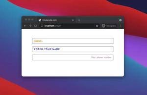
Preview
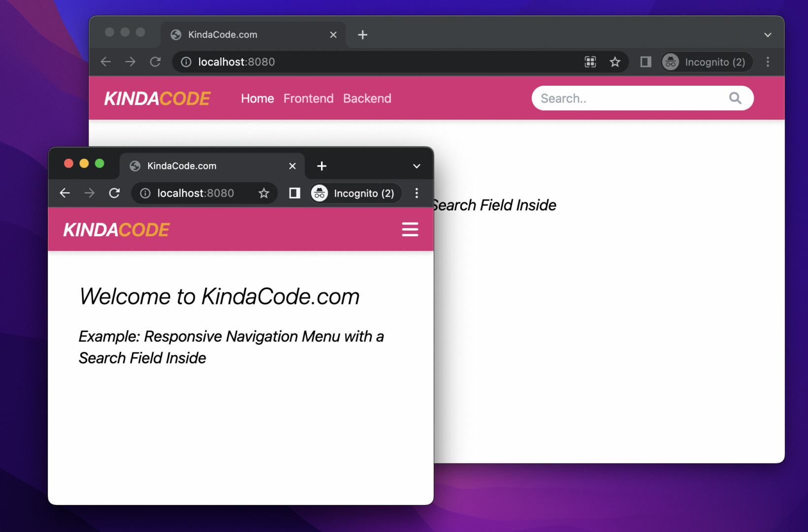
The navbar we’re going to make has a pink background. When the viewport width is equal or greater than 768px (the md breakpoint), the logo, links, and the search box sit in a row. When the viewport width is less than 768px, the links and the search box will disappear. Instead, you’ll see a hamburger icon button. This button is used to show/hide the menu for small screen devices (smartphones).
Words might be confusing and hard to follow. Here’s how it works:
The Code
Below is the full source code (the explanations are the comments) that produces the thing you see in the demo video above:
<!doctype html>
<html>

<head>
    <meta charset="UTF-8">
    <meta name="viewport" content="width=device-width, initial-scale=1.0">
    <meta http-equiv="X-UA-Compatible" content="ie=edge">
    <script src="https://cdn.tailwindcss.com"></script>
    <link rel="stylesheet" href="https://cdnjs.cloudflare.com/ajax/libs/font-awesome/6.1.1/css/all.min.css" />
    <title>KindaCode.com</title>
</head>

<body>
    <nav class="relative px-5 flex justify-between items-center h-14 bg-pink-600 drop-shadow-md">
        <!-- Logo -->
        <div>
            <a href="#" class="text-white text-2xl font-semibold italic">
                KINDA<span class="text-amber-500">CODE</span>
            </a>
        </div>

        <!-- This div and its children show up when screen's width >= 769px (md breakpoint) -->
        <div id="main-nav"
            class="hidden absolute top-14 right-0 px-5 py-10 bg-gray-700 h-screen flex flex-col
            md:flex md:space-y-0 md:relative md:top-0 md:right-0 md:p-0 md:flex-row md:h-full md:flex-grow md:justify-between md:items-center md:ml-10 md:bg-inherit">
            <!-- Menu Links -->
            <div
                class="order-last flex flex-col items-end text-pink-200 space-y-3  md:flex-row md:items-start md:order-first md:space-y-0 md:space-x-3">
                <a class="text-white" href="#">Home</a>
                <a class="hover:text-white" href="#">Frontend</a>
                <a class="hover:text-white" href="#">Backend</a>
            </div>

            <!-- Search box -->
            <form class="order-first mb-10 md:mb-0 md:order-last md:pr-8" action="">
                <input class="w-72 py-1 pl-3 pr-10 rounded-full focus:outline-0" type="text" placeholder="Search.."
                    name="search">
                <button class="-ml-8 border-6 bg-trasparent" type="submit"><i
                        class="fa fa-search text-gray-400"></i></button>
            </form>
        </div>

        <!-- The hamburger icon to open/close the #main-nav when screen width < 768px (mobile devices) -->
        <a class="md:hidden text-white text-2xl" href="javascript:void(0)" onclick="toggleMenu()"><i
                id="toggle-menu-icon" class="fa-bars fa-solid"></i></a>

    </nav>

    <!-- Other content -->
    <div class="p-10 space-y-5">
        <h1 class="text-3xl font-light italic">Welcome to KindaCode.com</h1>
        <h3 class="text-xl italic">Example: Responsive Navigation Menu with a Search Field Inside</h3>
    </div>

    <!-- Javascript code -->
    <script>
        var mainNav = document.getElementById("main-nav");
        var toggleMenuIcon = document.getElementById("toggle-menu-icon");

        function toggleMenu() {
            mainNav.classList.toggle('hidden');

            // change the icon when the menu is shown/closed
            toggleMenuIcon.classList.toggle('fa-bars');
            toggleMenuIcon.classList.toggle('fa-times');
        }
    </script>
</body>

</html>
To try it, just copy everything into a blank HTML file then open this file with your favorite web browser.
Afterword
We’ve built a nice responsive navbar with a logo and a search box inside with Tailwind CSS, vanilla Javascript, and Font Awesome icons. You can improve many aspects of the navbar to make it even better. Try to modify the code, replace the logo with yours, change some utility classes, remove some elements, add some elements and see how it looks like.
If you’d like to explore more new and interesting stuff about modern frontend development, take a look at the following articles:
- Tailwind CSS: How to Create a Full-Screen Overlay Menu
- Tailwind CSS: Create a Floating Action Button (FAB)
- Tailwind CSS: How to Create an Off-Canvas Side Menu
- Tailwind CSS: Create a Search Field with an Icon Inside
- Tailwind CSS: Expand a Text Input on Focus (without Javascript)
- Tailwind CSS: How to Create a Fixed Top Menu Bar
You can also check out our CSS category page for the latest tutorials and examples.