


This article is about styling text in Flutter. We’ll take a quick glance at the fundamentals and then examine a couple of practical examples. Without any further ado, let’s get started.
Overview
The TextStyle class is used to define the visual appearance of text in Flutter apps. It usually goes along with the Text widget, the DefaultTextStyle widget, or the TextTheme class.
The TextStyle class provides a ton of parameters that can help you control how your text looks, including color, size, weight, font family, and more. Below is the constructor:
TextStyle({
  bool inherit = true,
  Color? color,
  Color? backgroundColor,
  double? fontSize,
  FontWeight? fontWeight,
  FontStyle? fontStyle,
  double? letterSpacing,
  double? wordSpacing,
  TextBaseline? textBaseline,
  double? height,
  TextLeadingDistribution? leadingDistribution,
  Locale? locale,
  Paint? foreground,
  Paint? background,
  List<Shadow>? shadows,
  List<FontFeature>? fontFeatures,
  List<FontVariation>? fontVariations,
  TextDecoration? decoration,
  Color? decorationColor,
  TextDecorationStyle? decorationStyle,
  double? decorationThickness,
  String? debugLabel,
  String? fontFamily,
  List<String>? fontFamilyFallback,
  String? package,
  TextOverflow? overflow
})
Let’s take a closer look at the most used parameters:
- fontSize: This parameter sets the font size of the text. You can specify the size in logical pixels or points.
- color: This parameter sets the color of the text. You can specify any color from the Colors class or create your own custom color.
- fontWeight: This parameter sets the weight of the text. You can use values from the FontWeight enum, such as FontWeight.bold or FontWeight.normal.
- fontFamily: This parameter sets the font family of the text. You can specify any font that is installed on the device or a custom font.
- height: This parameter sets the height of the text, which is the distance between two consecutive baselines.
- letterSpacing: This parameter sets the spacing between characters in the text. You can specify a positive or negative value to increase or decrease the space between characters.
- decoration: This parameter sets the decoration style of the text, such as underline or strike-through.
- decorationColor: This parameter sets the color of the decoration style, such as underline or strike-through.
- decorationThickness: This parameter sets the thickness of the decoration style, such as underline or strike-through
Now it’s time for examples.
Examples
Using the “style” property of the Text widget
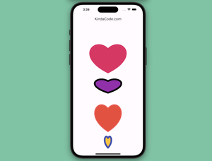
You can control the appearance of an individual Text widget by using its style property and the TextStyle class. The example below displays 3 Text widgets. The first is in the app bar, the second stays alone, and the last is in an elevated button. Each of them has a different style.
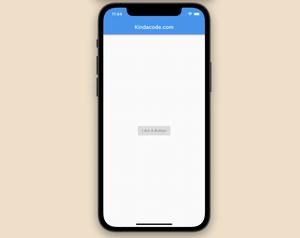
Screenshot:
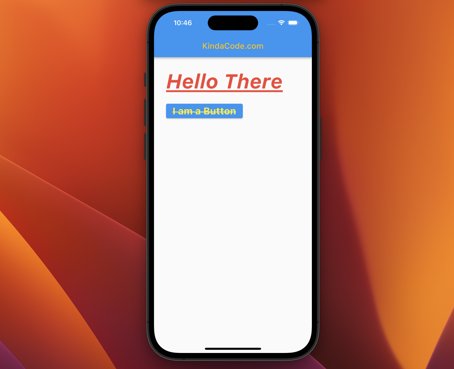
The code:
Scaffold(
      appBar: AppBar(
        title: const Text(
          'KindaCode.com',
          style: TextStyle(color: Colors.amber),
        ),
      ),
      body: Padding(
        padding: const EdgeInsets.all(30),
        child: Column(
          crossAxisAlignment: CrossAxisAlignment.start,
          children: [
            const Text(
              'Hello There',
              style: TextStyle(
                  fontSize: 50.0,
                  color: Colors.red,
                  fontWeight: FontWeight.bold,
                  fontStyle: FontStyle.italic,
                  decoration: TextDecoration.underline),
            ),
            const SizedBox(
              height: 20,
            ),
            ElevatedButton(
                onPressed: () {},
                child: const Text(
                  'I am a Button',
                  style: TextStyle(
                      fontSize: 24,
                      color: Colors.yellow,
                      fontWeight: FontWeight.bold,
                      decoration: TextDecoration.lineThrough),
                ))
          ],
        ),
      ),
);
Using the DefaultTextStyle widget
The DefaultTextStyle widget is a widget that provides a default text style for its descendants. It is especially useful when you want to set a consistent style for multiple text widgets in a big area in your app without writing duplicate code.
Screenshot:
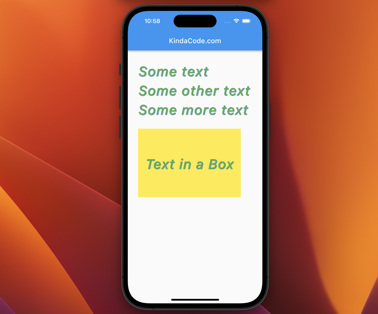
The code:
Scaffold(
      appBar: AppBar(
        title: const Text('KindaCode.com'),
      ),
      body: Padding(
        padding: const EdgeInsets.all(30),
        child: DefaultTextStyle(
          style: const TextStyle(
              fontSize: 40.0,
              color: Colors.green,
              fontWeight: FontWeight.w500,
              fontStyle: FontStyle.italic,
              letterSpacing: 1.2,
              height: 1.4,
              overflow: TextOverflow.ellipsis,
              shadows: [
                Shadow(
                  color: Colors.red,
                  offset: Offset(1.0, 1.0),
                  blurRadius: 2.0,
                ),
                Shadow(
                  color: Colors.blue,
                  offset: Offset(1.0, 1.0),
                  blurRadius: 2.0,
                ),
              ]),
          child: Column(
            crossAxisAlignment: CrossAxisAlignment.start,
            children: [
              const Text('Some text'),
              const Text('Some other text'),
              const Text('Some more text'),
              const SizedBox(height: 30),
              Container(
                width: 300,
                height: 200,
                color: Colors.yellow,
                child: const Center(child: Text('Text in a Box')),
              ),
            ],
          ),
        ),
      ),
);
See also: Using RichText and TextSpan in Flutter
Using Theme and TextTheme
The purpose of the TextTheme class is to provide a consistent set of styling options for text across an entire app. You can define a set of text styles that can be used in multiple places throughout your app, making it easy to update the look and feel of your text in the future.
The TextTheme class provides a set of predefined text styles, such as displayLarge, displayMedium, displaySmall, titleLarge, titleMedium, titleSmall, bodyLarge, bodyMedium, bodySmall, etc. You can use these predefined styles right away or override some of them to create your own custom text styles to meet the needs of your app.
In order to set the style for a Text widget with the current TextTheme, you can do as follow:
Text(
'Title Large',
style: Theme.of(context).textTheme.titleLarge,
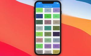
),Let’s examine the complete example below for more clarity.
Screenshot:
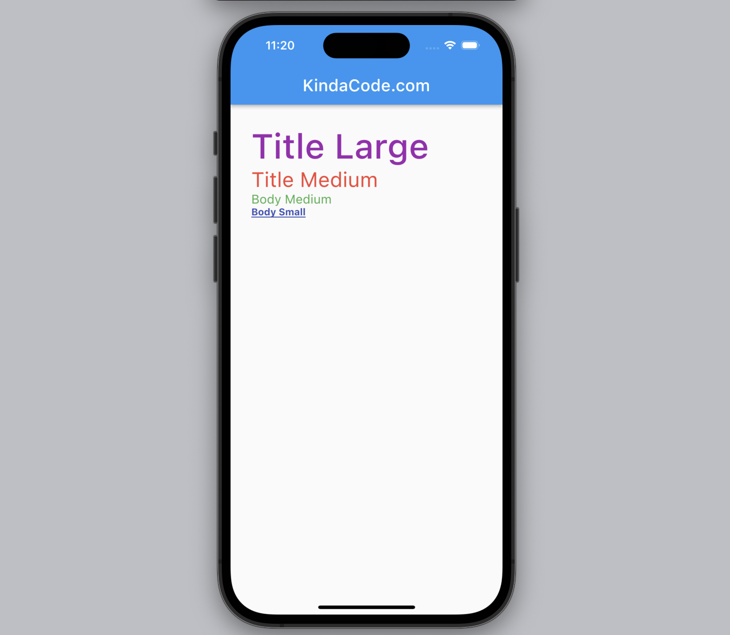
The code:
import 'package:flutter/material.dart';

void main() {
  runApp(const MyApp());
}

class MyApp extends StatelessWidget {
  const MyApp({super.key});
  @override
  Widget build(BuildContext context) {
    return MaterialApp(
      // hide the debug banner
      debugShowCheckedModeBanner: false,
      title: 'KindaCode.com',
      theme: ThemeData(
        primarySwatch: Colors.blue,
        // Override some of the default text styles
        textTheme: const TextTheme(
            titleLarge: TextStyle(fontSize: 50, color: Colors.purple),
            titleMedium: TextStyle(fontSize: 30, color: Colors.red),
            titleSmall: TextStyle(fontSize: 24, color: Colors.white),
            bodyMedium: TextStyle(fontSize: 18, color: Colors.green),
            bodySmall: TextStyle(
                fontSize: 14,
                color: Colors.indigo,
                fontWeight: FontWeight.bold,
                decoration: TextDecoration.underline)),
      ),
      home: const MyHomePage(),
    );
  }
}

class MyHomePage extends StatelessWidget {
  const MyHomePage({super.key});

  @override
  Widget build(BuildContext context) {
    return Scaffold(
      appBar: AppBar(
        title: Text(
          'KindaCode.com',
          style: Theme.of(context).textTheme.titleSmall,
        ),
      ),
      body: Padding(
        padding: const EdgeInsets.all(30),
        child: Column(crossAxisAlignment: CrossAxisAlignment.start, children: [
          Text(
            'Title Large',
            style: Theme.of(context).textTheme.titleLarge,
          ),
          Text(
            'Title Medium',
            style: Theme.of(context).textTheme.titleMedium,
          ),
          Text(
            'Body Medium',
            style: Theme.of(context).textTheme.bodyMedium,
          ),
          Text(
            'Body Small',
            style: Theme.of(context).textTheme.bodySmall,
          ),
        ]),
      ),
    );
  }
}
See also: How to create selectable text in Flutter
Conclusion
You’ve learned the fundamentals of the TextStyle class and walked through several examples of how to style text in apps. If you’d like to explore more new and interesting stuff about Flutter and Dart, take a look at the following articles:
- Flutter TextField: Styling labelText, hintText, and errorText
- Adding a Border to Text in Flutter
- Text Overflow in Flutter: Tutorial & Examples
- Flutter & Hive Database: CRUD Example
- Using GetX (Get) for State Management in Flutter
- 3 Ways to create Random Colors in Flutter
You can also tour around our Flutter topic page or Dart topic page for the most recent tutorials and examples.


