This article is about the ActivityIndicator component in React Native.
Table of Contents
Overview
ActivityIndicator is a built-in component in React Native that presents a circular progress indicator, which can spin to indicate that the app is busy doing something (making HTTP requests, processing files, etc).
Props:
| Prop | Type | Default Value | Description |
|---|---|---|---|
| animating | bool | true | show the indicator or not |
| color | color | Android: null iOS: ‘#999999’ | set the foreground color of the spinner |
| size | enum(‘small’, ‘large’) number (Android only) | ‘small’ | how big the indicator is |
| hidesWhenStopped (iOS only) | bool | true | hide the indicator when it stops |
Examples
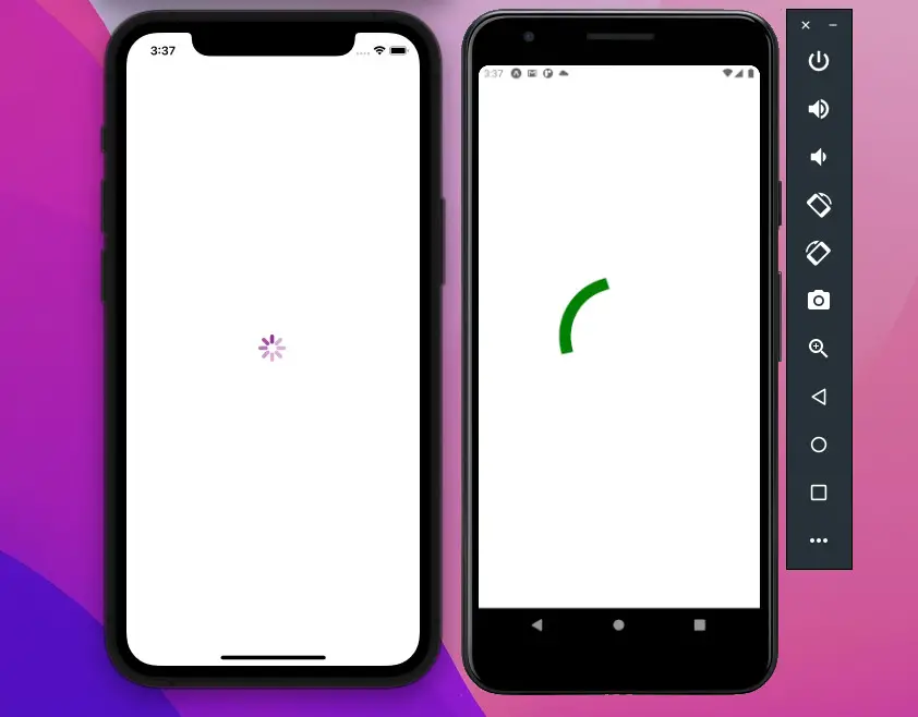
The First Example
This example simply displays a loading indicator:
The code:
import React from "react";
import { StyleSheet, View, ActivityIndicator, Platform } from "react-native";

const App = () => {
  return (
    <View style={styles.screen}>
      {Platform.OS === "ios" ? (
        <ActivityIndicator size="large" color="purple" />
      ) : (
        <ActivityIndicator size={200} color="green" />
      )}
    </View>
  );
};

// just some styles for our app
const styles = StyleSheet.create({
  screen: {
    flex: 1,
    justifyContent: "center",
    alignItems: "center",
  },
});

export default App;
The Second Example
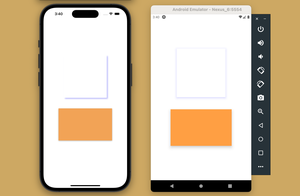
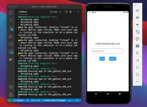
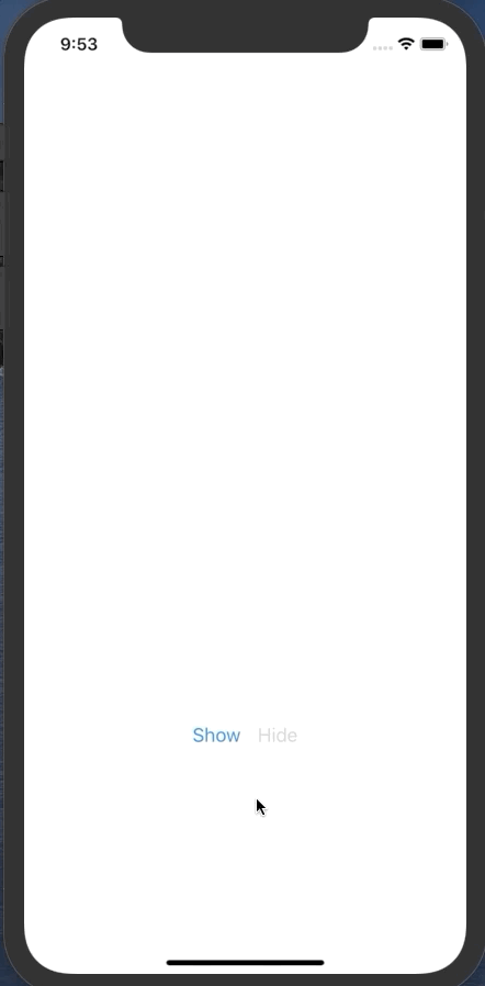
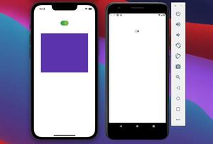
In this example, we’ll create a simple React Native app that has 2 buttons: Show and Hide.
- When you touch the Show one, our circle loading indicator will show up.
- The indicator will leave the screen when the Hide button is touched.
import React, { useState } from 'react';
import {StyleSheet, View, Button, ActivityIndicator} from 'react-native';

const App = () => {
  const [isShown, setIsShown] = useState(false);
  return (
    <View style={styles.screen}>
      <ActivityIndicator animating={isShown} size="large" color="#3b63b3" />
      <View style={styles.buttonWrapper}>
        {/* This button is touchable only when the indicator is hidden */}
        <Button title="Show" disabled={isShown} onPress={() => setIsShown(true)} />

        {/* This button is touchable only when the indicator is shown */}
        <Button title="Hide" disabled={!isShown} onPress={() => setIsShown(false)} />
      </View>
    </View>
  );
};

// just some styles for our app
const styles = StyleSheet.create({
  screen: {
    flex: 1,
    flexDirection: 'column',
    justifyContent: 'space-around',
    alignItems: 'center',
  },
  buttonWrapper: {
    flexDirection: 'row'
  }
});

export default App;
When you run your app, it should look like this:
Conclusion
We’ve walked through a few examples of implementing the ActivityIndicator component. If you’d like to explore more new and exciting stuff about modern React Native, take a look at the following articles:
- How to Get the Window Width & Height in React Native
- How to Get Platform Information in React Native
- React Native: Make a Button with a Loading Indicator inside
- Using AsyncStorage in React Native: CRUD Example
- How to Implement a Picker in React Native
You can also check our React topic page and React Native topic page for the latest tutorials and examples.
![[Solved] React Native Error: No bundle URL present](https://www.kindacode.com/media/thumbnails/2024-11/Screen-Shot-2020-04-28-at-17.44.18-1.png)