This article walks you through a complete example of creating a responsive top navigation menu in React. We’ll build everything from the ground up with only native features of React and pure CSS. Neither NPM packages nor third-party CSS libraries will be used.
Prerequisites: Basic knowledge of React and CSS.
Table of Contents
The Example
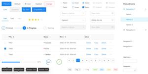
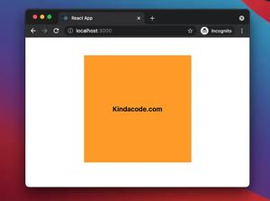
Preview
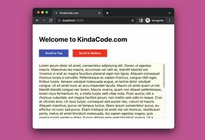
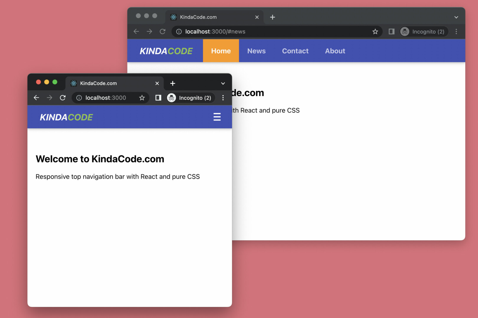
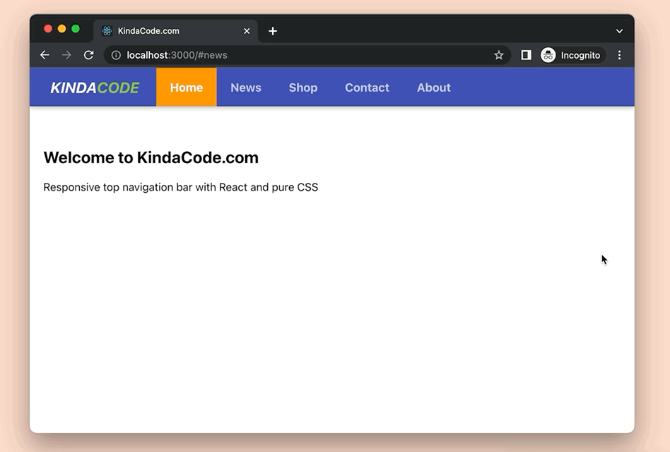
What we’re going to make is a web app with a bluish navbar. This navbar contains a logo and some links. When the screen is equal to or larger than 680px (I think this breakpoint makes sense, but you can adjust it if you want), all of the links lie in a horizontal row. When the window width is less than 680px, these links will disappear. Instead, you’ll notice a hamburger button on the right side that can be used to open the mobile menu, which fits small screen sizes very well. You can close this mobile menu with the X button in the top right corner. The GIF below clearly depicts what I am saying:
The Code
Below are the steps to produce the demo above.
1. Start a new React project:
npx create-react-app kindacode-exampleThe name doesn’t matter. Choose whatever you want. As of now, we’ll only focus only on 2 files: src/App.js and src/App.css. In order to make this tutorial easier to follow, I’ll put all code into these files. You can refactor and split them into more small files later if you want (it’s a good practice to store each React component in a single file).
2. The full code in App.js (with explanations):
// KindaCode.com
// src/App.js
import { useState } from 'react';
import './App.css';
// Define MobileMenu component
const MobileMenu = () => {
return (
<div className={'mobile-menu'}>
<a href='#home'>Home</a>
<a href='#news'>News</a>
<a href='#shop'>Shop</a>
<a href='#contact'>Contact</a>
<a href='#about'>About</a>
<a href='#privacy'>Privacy Policy</a>
</div>
);
};
function App() {
const [isShown, setIsShown] = useState(false);
const toggleMobileMenu = () => {
setIsShown(!isShown);
};
return (
<>
<div className='topnav'>
{/* Your Logo/Brand here */}
<div className='logo'>
KINDA<span>CODE</span>
</div>
{/* Desktop Menu, which only appears on large screens */}
<div className='menu'>
<a href='#home' className='active-link'>
Home
</a>
<a href='#news'>News</a>
<a href='#shop'>Shop</a>
<a href='#contact'>Contact</a>
<a href='#about'>About</a>
</div>
{/* This button only shows up on small screens. It is used to open the mobile menu */}
<button className='show-mobile-menu-button' onClick={toggleMobileMenu}>
≡
</button>
</div>
{/* The mobile menu and the close button */}
{isShown && <MobileMenu />}
{isShown && (
<button className='close-mobile-menu-button' onClick={toggleMobileMenu}>
×
</button>
)}
{/* Dummy content */}
<div className='content'>
<h2>Welcome to KindaCode.com</h2>
<p>Responsive top navigation bar with React and pure CSS</p>
</div>
</>
);
}
export default App;3. An indispensable ingredient to make it works properly is CSS. Remove everything in your src/App.css file and add the following:
.topnav {
  height: 56px;
  padding: 0px 20px;
  background: #3f51b5;
  display: flex;
  justify-content: space-between;
  box-shadow: 0 2px 5px 0 rgba(0, 0, 0, 0.16), 0 2px 10px 0 rgba(0, 0, 0, 0.12);
}

/* Style the logo */
.logo {
  height: 100%;
  width: 150px;
  display: flex;
  justify-content: center;
  align-items: center;
  color: #fff;
  font-size: 22px;
  font-style: italic;
  font-weight: bold;
}

.logo span {
  color: #8bc34a;
}

/* Desktop Menu */
.menu {
  margin-left: 15px;
  height: 100%;
  display: none;
}

.menu a {
  height: 100%;
  display: inline-flex;
  align-items: center;
  padding: 0 20px;
  color: rgba(255, 255, 255, 0.7);
  font-weight: bold;
  font-size: 17px;
  text-decoration: none;
  transition: 0.3s;
}

.menu a:hover,
.menu a.active-link {
  background: #ff9800;
  color: #fff;
}

/* Mobile Menu Show & Close buttons */
.show-mobile-menu-button {
  display: inline-flex;
  justify-content: center;
  align-items: center;
  border: none;
  background: transparent;
  font-size: 36px;
  color: #fff;
  cursor: pointer;
}

.close-mobile-menu-button {
  position: fixed;
  z-index: 999;
  top: 0;
  right: 0;
  width: 60px;
  height: 60px;
  display: inline-flex;
  justify-content: center;
  align-items: center;
  border: none;
  background: transparent;
  font-size: 50px;
  color: #fff;
  cursor: pointer;
}

/* Mobile Menu */
.mobile-menu {
  position: fixed;
  z-index: 99;
  top: 0;
  left: 0;
  width: 100vw;
  height: 100vh;
  display: flex;
  flex-direction: column;
  justify-content: center;
  align-items: center;
  background: rgba(0, 0, 0, 0.85);
  transition: 0.3s;
}

.mobile-menu a {
  padding: 10px 0px;
  color: rgba(255, 255, 255, 0.7);
  font-weight: bold;
  font-size: 20px;
  text-decoration: none;
}

.mobile-menu a:hover {
  color: orange;
}

/* Media queries for responsiveness */
@media screen and (min-width: 680px) {
  .topnav {
    justify-content: flex-start;
  }

  .show-mobile-menu-button {
    display: none;
  }

  .menu {
    display: flex;
    align-items: center;
  }
}

/* Other styles */
.content {
  padding: 40px 20px;
}
4. Run the project in the development mode:
npm startAnd go to http://localhost:3000 to interact with your creation.
Conclusion
We’ve walked through an end-to-end example of implementing a responsive menu bar in React. The logic in our JS code is quite simple. I think the harder part is CSS. Writing code and making things from scratch is tough, but it gives you the freedom to deeply customize the appearance and functionality of your app and reduce the reliance on third-party libraries.
If you’d like to explore countless fascinating stuff in the realm of React development, take a look at the following articles:
- How to Use Styled JSX in React: A Deep Dive
- How to Use Tailwind CSS in React
- React: 2 Ways to Open an External Link in New Tab
- React Router Dom: Implement a Not Found (404) Route
- React Router: How to Create a Custom Back Button
- React Router: How to Highlight Active Link
You can also check our React category page and React Native category page for the latest tutorials and examples.