


A tooltip displays an informative message when users hover, tap, or focus on an element.
In Flutter, you can use a built-in widget named Tooltip to create tooltips with ease. In this article, we’ll go over a complete example of using the Tooltip widget in practice (with Material 3), and then see its constructor as well as the properties.
Table of Contents
The Example
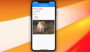
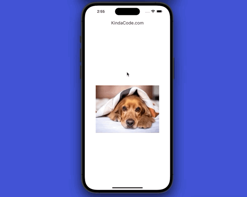
Preview
This tiny app displays an image in the center of the screen. A tooltip with an indigo background will show up when you long-press the image:
The Code
The full source code in main.dart:
// main.dart
import 'package:flutter/material.dart';

void main() {
  runApp(const MyApp());
}

class MyApp extends StatelessWidget {
  const MyApp({Key? key}) : super(key: key);

  @override
  Widget build(BuildContext context) {
    return MaterialApp(
      // Remove the debug banner
      debugShowCheckedModeBanner: false,
      title: 'KindaCode.com',
      theme: ThemeData(primarySwatch: Colors.pink, useMaterial3: true),
      home: const HomeScreen(),
    );
  }
}

class HomeScreen extends StatefulWidget {
  const HomeScreen({Key? key}) : super(key: key);

  @override
  State<HomeScreen> createState() => _HomeScreenState();
}

class _HomeScreenState extends State<HomeScreen> {
  @override
  Widget build(BuildContext context) {
    return Scaffold(
      appBar: AppBar(
        title: const Text('KindaCode.com'),
      ),
      body: Center(
          child: Tooltip(
              message: 'This is a cute dog. Do you like him?',
              padding: const EdgeInsets.all(30),
              margin: const EdgeInsets.only(top: 80, left: 50),
              decoration: BoxDecoration(
                  color: Colors.indigo,
                  borderRadius: BorderRadius.circular(20)),
              textStyle: const TextStyle(
                  fontSize: 15,
                  fontStyle: FontStyle.italic,
                  color: Colors.white),
              child: SizedBox(
                width: 320,
                height: 240,
                child: Image.network(
                  'https://www.kindacode.com/wp-content/uploads/2021/10/the-dog.jpeg',
                  fit: BoxFit.cover,
                ),
              ))),
    );
  }
}
API
In order to add a tooltip to a widget, what you need to do is to wrap that widget inside a Tooltip widget, like this:
Tooltip(
   message: 'This is a tooltip',
   child: OutlinedButton(onPressed: () {}, child: const Text('A Button')),
)
Constructor:
Tooltip({
  Key? key,
  String? message,
  InlineSpan? richMessage,
  double? height,
  EdgeInsetsGeometry? padding,
  EdgeInsetsGeometry? margin,
  double? verticalOffset,
  bool? preferBelow,
  bool? excludeFromSemantics,
  Decoration? decoration,
  TextStyle? textStyle,
  Duration? waitDuration,
  Duration? showDuration,
  Widget? child,
  TooltipTriggerMode? triggerMode,
  bool? enableFeedback
})
Frequently used options:
height: Specifies the height of the tooltippadding: Padding of the tooltipmargin: Margin of the tooltipdecoration: Controls the shape and background color of the tooltippreferBelow: The tooltip will show up below the child or notshowDuration: How long the tooltip will be showntextStyle: The style of the tooltip’s messagewaitDuration: The amount of time that a pointer must over the tooltip before the message appearsverticalOffset: The vertical gap between the widget and the displayed tooltipenableFeedback: Whether the tooltip provides acoustic and/or haptic feedback
Conclusion
You’ve learned the fundamentals and gone through an example of using the Tooltip widget to provide extra useful information to your users. If you’d like to explore more new and awesome features in Flutter, take a look at the following articles:
- Flutter: Drawing an N-Pointed Star with CustomClipper
- Adding a Border to Text in Flutter
- Flutter: Stream.periodic example
- Flutter: DropdownButton Example
- Flutter: How to Colorize Debug Console Logs
- Using Cascade Notation in Dart and Flutter
You can also take a tour around our Flutter topic page and Dart topic page to see the latest tutorials and examples.


