

This practical article walks you through four examples of creating triangles with Tailwind CSS.
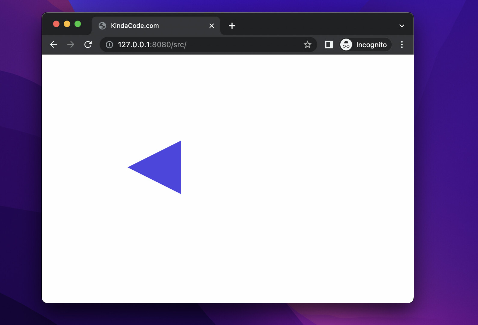
Example 1: Triangle Left
Screenshot:
The code:
<body class="p-40">
<div class="w-0 h-0
border-t-[50px] border-t-transparent
border-r-[100px] border-r-indigo-600
border-b-[50px] border-b-transparent
"></div>
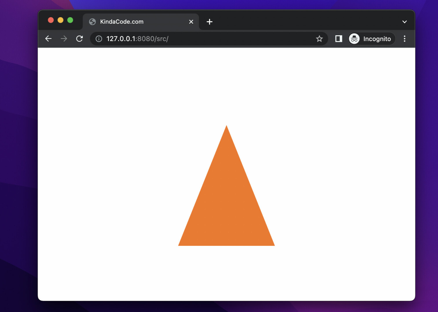
</body>Example 2: Triangle Up
It closely resembles a cone.
Screenshot:
The code:
<body class="p-40 flex justify-center items-center">
<div class="w-0 h-0
border-l-[100px] border-l-transparent
border-b-[250px] border-b-orange-500
border-r-[100px] border-r-transparent
"></div>
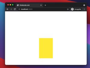
</body>Example 3: Triangle Right
A right triangle looks like a play button of a video player.
Screenshot:

The code:
<body class="p-40 bg-amber-100">
<div class="w-0 h-0
border-t-[80px] border-t-transparent
border-l-[200px] border-l-rose-600
border-b-[80px] border-b-transparent
"></div>
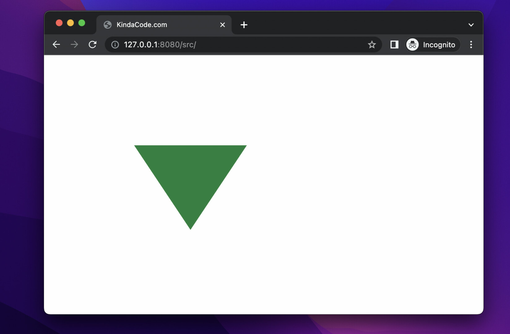
</body>Example 4: Triangle Down
It looks similar to a projection of a funnel.
Screenshot:
The code:
<body class="p-40">
    <div class="w-0 h-0
   border-l-[100px] border-l-transparent
   border-t-[150px] border-t-green-700
   border-r-[100px] border-r-transparent
    "></div>
</body>
Summary
Did you notice the trick we used to create the triangles? That is, we create a <div> with zero width and height, which has a large-sized edge with a certain color and two adjacent edges it also has a large size, but the background color is transparent.
Keep the ball rolling and continue learning more about modern web technologies by taking a look at the following articles:
- Tailwind CSS: How to Disable Text Selection
- Text Shadows in Tailwind CSS
- Tailwind CSS: Create a Responsive Top Navigation Menu
- Tailwind CSS: Create a Fixed/Sticky Footer Menu
- How to Create a Modal Dialog with Tailwind CSS
- How to Style Breadcrumb Navigation with Tailwind CSS
You can also check out our CSS category page for the latest tutorials and examples.