


In Flutter, scrollable widgets (ListView, GridView, etc) have no scrollbar by default. A scrollbar lets a user know how long a view is. It indicates how far the user has scrolled from the top boundary and lets him or her quickly jump to a particular point.
In this article, we’ll have a look at the Scrollbar widget in Flutter and learn how to style and customize it through a couple of different examples (the last one implements a CupertinoScrollbar).
Overview
To add a scroll bar, just wrap your view with a Scrollbar widget. The only required parameter of a Scrollbar is a child widget. Others are optional.
| Parameter | Type | Description |
|---|---|---|
| child (required) | Widget | The child widget of the Scrollbar (ListView, GridView, …) |
| thickness | double | The thickness of the scrollbar |
| showTrackOnHover | bool | Determine whether the track will show on hover and remain, including during drag |
| controller | ScrollController | Controls the Scrollbar dragging |
| hoverThickness | double | Determine the thickness of the scrollbar when a hover state is active and showTrackOnHover is true |
| thumbVisibility | bool | Determine the scrollbar thumb will always remain visible or will fade out when it is not in use. |
| notificationPredicate | ScrollNotificationPredicate | Check whether a ScrollNotification should be handled by the Scrollbar |
| radius | Radius | Set the shape of the scrollbar thumb (rounded corners) |
If the child widget of the Scrollbar has an infinite length (for example, when you use ListView.builder or GridView.builder without passing itemCount), the Scrollbar will not show up. However, there is no error message in this case.
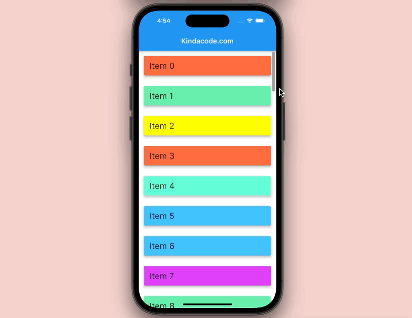
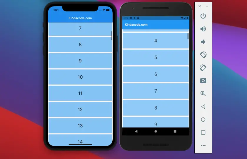
Example 1: Basic Implementation
Preview:
The full code:
import 'package:flutter/material.dart';
import 'dart:math';

void main() {
  runApp(const MyApp());
}

class MyApp extends StatelessWidget {
  const MyApp({Key? key}) : super(key: key);

  @override
  Widget build(BuildContext context) {
    return MaterialApp(
      debugShowCheckedModeBanner: false,
      title: 'Kindacode.com',
      theme: ThemeData(
        primarySwatch: Colors.blue,
      ),
      home: HomePage(),
    );
  }
}

class HomePage extends StatelessWidget {
  HomePage({Key? key}) : super(key: key);

  // Dummy data
  final _myList = List.generate(50, (index) => 'Item $index');

  @override
  Widget build(BuildContext context) {
    return Scaffold(
      appBar: AppBar(
        title: const Text('Kindacode.com'),
      ),
      body: Scrollbar(
        // I use a big thickness to make the thumb is easy to be seen
        // You should chose another number that makes more sense
        thickness: 10,
        thumbVisibility: true,
        radius: const Radius.circular(10), // give the thumb rounded corners
        child: ListView.builder(
          itemCount: _myList.length, // Don't forget this line
          itemBuilder: (context, index) => Card(
            key: ValueKey(_myList[index]),
            margin: const EdgeInsets.all(15),
            elevation: 5,
            color: Colors.accents[Random().nextInt(Colors.accents.length)],
            child: ListTile(
              title: Text(
                _myList[index],
                style: const TextStyle(fontSize: 24),
              ),
            ),
          ),
        ),
      ),
    );
  }
}
Example 2: Using scrollbarTheme
In this example, we’ll style the Scrollbar by using the ScrollbarThemeData class. Color, minimum thumb length, scrollbar margin, and much more are all set as we want.
Note: Since the Scrollbar dynamically changes to an iOS-style scrollbar on the iOS platform, using scrollbarTheme only makes effects on Android as you can see in the video below.
Preview:
The full code:
import 'package:flutter/material.dart';

void main() {
  runApp(const MyApp());
}

class MyApp extends StatelessWidget {
  const MyApp({Key? key}) : super(key: key);

  @override
  Widget build(BuildContext context) {
    return MaterialApp(
      debugShowCheckedModeBanner: false,
      title: 'Kindacode.com',
      theme: ThemeData(
          primarySwatch: Colors.green,
          scrollbarTheme: ScrollbarThemeData(
              thumbVisibility: MaterialStateProperty.all(true),
              thickness: MaterialStateProperty.all(10),
              thumbColor: MaterialStateProperty.all(Colors.blue),
              radius: const Radius.circular(10),
              minThumbLength: 100)),
      home: HomePage(),
    );
  }
}

class HomePage extends StatelessWidget {
  HomePage({Key? key}) : super(key: key);

  // Generating dummy data for testing purpose
  final List dummyData = List.generate(100, (index) => '$index');
  @override
  Widget build(BuildContext context) {
    return Scaffold(
      appBar: AppBar(
        title: const Text('Kindacode.com'),
      ),
      body: Scrollbar(
        child: GridView.builder(
          itemCount: dummyData.length,
          gridDelegate: const SliverGridDelegateWithMaxCrossAxisExtent(
              maxCrossAxisExtent: 200,
              childAspectRatio: 3 / 2,
              crossAxisSpacing: 20,
              mainAxisSpacing: 20),
          itemBuilder: (context, index) {
            return GridTile(
                child: Container(
              color: Colors.amberAccent,
              alignment: Alignment.center,
              child: Text(
                dummyData[index],
                style: const TextStyle(fontSize: 24),
              ),
            ));
          },
        ),
      ),
    );
  }
}
Example 3: Using CupertinoScrollbar
Using the CupertinoScrollbar widget is quite similar to using the Scrollbar widget. Don’t forget to import the cupertino library into your code:
import 'package:flutter/cupertino.dart';Screenshot:
The full code:
import 'package:flutter/cupertino.dart';
import 'package:flutter/material.dart';

void main() {
  runApp(const MyApp());
}

class MyApp extends StatelessWidget {
  const MyApp({Key? key}) : super(key: key);

  @override
  Widget build(BuildContext context) {
    return MaterialApp(
      debugShowCheckedModeBanner: false,
      title: 'Kindacode.com',
      home: HomePage(),
    );
  }
}

class HomePage extends StatelessWidget {
  HomePage({Key? key}) : super(key: key);

  // Generating dummy data for testing purpose
  final List dummyData = List.generate(100, (index) => '$index');

  @override
  Widget build(BuildContext context) {
    return Scaffold(
      appBar: AppBar(
        title: const Text('Kindacode.com'),
      ),
      body: CupertinoScrollbar(
          thickness: 8,
          thumbVisibility: true,
          child: ListView.builder(
            itemCount: dummyData.length,
            itemBuilder: (context, index) => Card(
              color: Colors.blue[200],
              child: Padding(
                padding: const EdgeInsets.all(30),
                child: Center(
                  child: Text(
                    dummyData[index],
                    style: const TextStyle(fontSize: 30),
                  ),
                ),
              ),
            ),
          )),
    );
  }
}
Conclusion
We’ve explored a lot of things about the Scrollbar widget and walked over a few examples of using it in applications. If you’d like to learn more new and fascinating stuff in Flutter, take a look at the following articles:
- How to disable Web and Desktop support in Flutter
- Flutter + Firebase Storage: Upload, Retrieve, and Delete files
- Flutter and Firestore Database: CRUD example
- Most Popular Packages for State Management in Flutter
- Flutter SliverAppBar Example (with Explanations)
You can also check out our Flutter topic page or Dart topic page for the latest tutorials and examples. Have a nice day and happy Fluttering.