


This article will guide you to making a color picker from scratch in Flutter without using any third-party plugins.
Introduction
Color picker is a thing that frequently appears in many kinds of apps like notes, todos, social networks, reading apps, etc. It lets the user change the background and text colors or something like that.
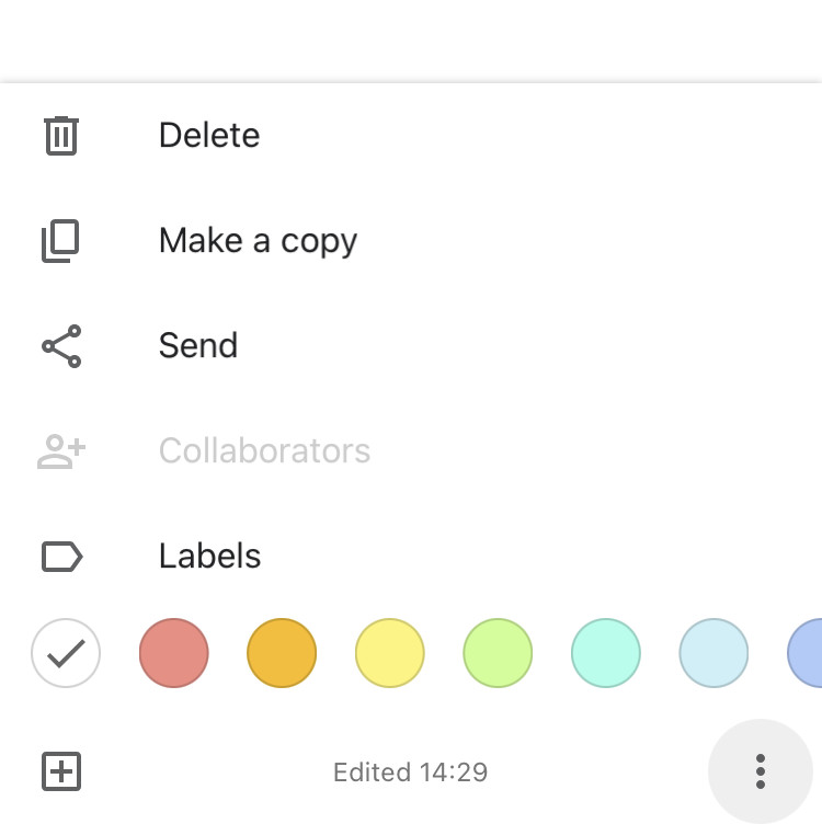
In general, a mobile app rarely needs a complex color picker like the ones in powerful design software like Photoshop or Procreate. Below is a color picker used in Keep (a note app from Google):
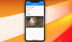
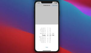
And this is some kind of color picker that you can see in Kindle (a reading app from Amazon):
There are many color picker packages out there but sometimes, none of them 100% fits your need. There are a number of reasons such as:
- A package is too complicated to use and the document isn’t clear enough. Learning its API takes much time.
- A package is good and has many useful features but the feature you need.
- You play around with a package for hours and finally find out that there is no way to make it fit your app’s UI unless modifying the package’s source code.
Creating your own color picker will allow you to customize it completely. Besides, you’ll understand Flutter more deeply and will be able to create a lot of useful reusable stuff in the future and publish your own open-source plugins to help others. The trade-off, however, will be that you will find it a bit difficult and time-consuming to get started if you are new to Flutter.
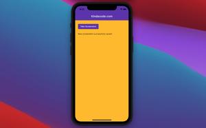
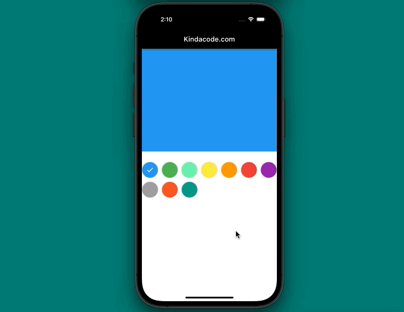
Preview
The color picker we will build together has the following features:
- You can customize the list of pickable colors. This will make the colors that are most beautiful and best suited to your app appear.
- The selected color will have a checkmark.
- You can select color cells in the form of rectangles or circles.
Although quite simple, it is sufficient for use in most types of mobile applications. Also, it is quite flexible.
The screen capture:
Let’s Write Code
Create a reusable widget named MyColorPicker
Create a new file named my_color_picker.dart in your lib directory and add the following code:
// my_color_picker.dart
import 'package:flutter/material.dart';

class MyColorPicker extends StatefulWidget {
  // This function sends the selected color to outside
  final Function onSelectColor;

  // List of pickable colors
  final List<Color> availableColors;

  // The default picked color
  final Color initialColor;

  // Determnie shapes of color cells
  final bool circleItem;

  const MyColorPicker(
      {Key? key,
      required this.onSelectColor,
      required this.availableColors,
      required this.initialColor,
      this.circleItem = true})
      : super(key: key);

  @override
  State<MyColorPicker> createState() => _MyColorPickerState();
}

class _MyColorPickerState extends State<MyColorPicker> {
  // This variable used to determine where the checkmark will be
  late Color _pickedColor;

  @override
  void initState() {
    _pickedColor = widget.initialColor;
    super.initState();
  }

  @override
  Widget build(BuildContext context) {
    return SizedBox(
      width: double.infinity,
      height: 200,
      child: GridView.builder(
        gridDelegate: const SliverGridDelegateWithMaxCrossAxisExtent(
            maxCrossAxisExtent: 50,
            childAspectRatio: 1 / 1,
            crossAxisSpacing: 10,
            mainAxisSpacing: 10),
        itemCount: widget.availableColors.length,
        itemBuilder: (context, index) {
          final itemColor = widget.availableColors[index];
          return InkWell(
            onTap: () {
              widget.onSelectColor(itemColor);
              setState(() {
                _pickedColor = itemColor;
              });
            },
            child: Container(
              width: 50,
              height: 50,
              decoration: BoxDecoration(
                  color: itemColor,
                  shape: widget.circleItem == true
                      ? BoxShape.circle
                      : BoxShape.rectangle,
                  border: Border.all(width: 1, color: Colors.grey.shade300)),
              child: itemColor == _pickedColor
                  ? const Center(
                      child: Icon(
                        Icons.check,
                        color: Colors.white,
                      ),
                    )
                  : Container(),
            ),
          );
        },
      ),
    );
  }
}
Usage
Now you can use the color picker by using the constructor shown below:
MyColorPicker({
  Function onSelectColor,
  List<Color> availableColors,
  Color initialColor,
  bool circleItem = true
})
Full example
// main.dart
import 'package:flutter/material.dart';

// import our custom color picker
import './my_color_picker.dart';

void main() {
  runApp(const MyApp());
}

class MyApp extends StatelessWidget {
  const MyApp({Key? key}) : super(key: key);

  @override
  Widget build(BuildContext context) {
    return const MaterialApp(
      // Remove the debug banner
      debugShowCheckedModeBanner: false,
      title: 'Kindacode.com',
      home: HomePage(),
    );
  }
}

class HomePage extends StatefulWidget {
  const HomePage({Key? key}) : super(key: key);

  @override
  State<HomePage> createState() => _HomePageState();
}

class _HomePageState extends State<HomePage> {
  Color _color = Colors.blue;

  @override
  Widget build(BuildContext context) {
    return Scaffold(
      appBar: AppBar(
        title: const Text('Kindacode.com'),
        backgroundColor: Colors.black,
      ),
      body: Column(
        children: [
          Container(
            width: double.infinity,
            height: 300,
            color: _color,
          ),
          const SizedBox(height: 30),
          MyColorPicker(
              onSelectColor: (value) {
                setState(() {
                  _color = value;
                });
              },
              availableColors: const [
                Colors.blue,
                Colors.green,
                Colors.greenAccent,
                Colors.yellow,
                Colors.orange,
                Colors.red,
                Colors.purple,
                Colors.grey,
                Colors.deepOrange,
                Colors.teal
              ],
              initialColor: Colors.blue)
        ],
      ),
    );
  }
}
Conclusion
Congratulation! You’ve built a neat and useful color picker that you can reuse in your next projects. Furthermore, you now get a better understanding of how to write a package like other packages on pub.dev.
To continue learning more interesting stuff about Flutter, you can take a look at the following articles:
- Flutter ColorFiltered Examples
- Flutter StreamBuilder examples
- Flutter Autocomplete example
- 3 Ways to create Random Colors in Flutter
- Flutter: Check Internet Connection without any plugins
- Write a simple BMI Calculator with Flutter
You can also check out our Flutter category page or Dart category page for the latest tutorials and examples.


