


This article walks you through a couple of different examples of using the LayoutBuilder widget in Flutter applications.
A Prefatory Note
The LayoutBuilder widget in Flutter helps you build a widget tree that can depend on the parent widget’s size (a minimum and maximum width and a minimum and maximum height).
Implementation:
LayoutBuilder(
          builder: (context, constraints) {
            return /* your widget tree here */
          },
        )
Example 1: Building a Simple Layout
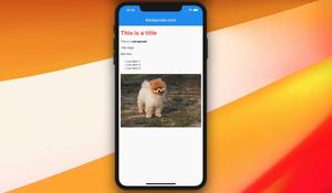
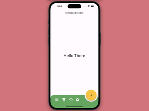
In this example, the descendant widgets of the LayoutBuilder don’t have fixed widths and heights but depend on the size of the parent LayoutBuilder.
Screenshot:
The complete code:
// main.dart
import 'package:flutter/material.dart';

void main() {
  runApp(const MyApp());
}

class MyApp extends StatelessWidget {
  const MyApp({Key? key}) : super(key: key);

  @override
  Widget build(BuildContext context) {
    return MaterialApp(
      // Remove the debug banner
      debugShowCheckedModeBanner: false,
      title: "Kindacode.com",
      home: HomePage(),
    );
  }
}

class HomePage extends StatelessWidget {
  @override
  Widget build(BuildContext context) {
    return Scaffold(
        appBar: AppBar(
          title: const Text('Kindacode.com'),
        ),
        body: LayoutBuilder(
          builder: (context, constraints) {
            return Column(children: [
              Container(
                  color: Colors.yellow,
                  width: constraints.maxWidth,
                  height: constraints.maxHeight * 0.5),
              Container(
                  color: Colors.green,
                  width: constraints.maxWidth,
                  height: constraints.maxHeight * 0.2),
              Container(
                  color: Colors.red,
                  width: constraints.maxWidth * 0.4,
                  height: constraints.maxHeight * 0.3),
            ]);
          },
        ));
  }
}
Example 2: Build a Responsive UI for multiple screen sizes
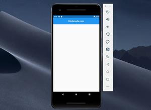
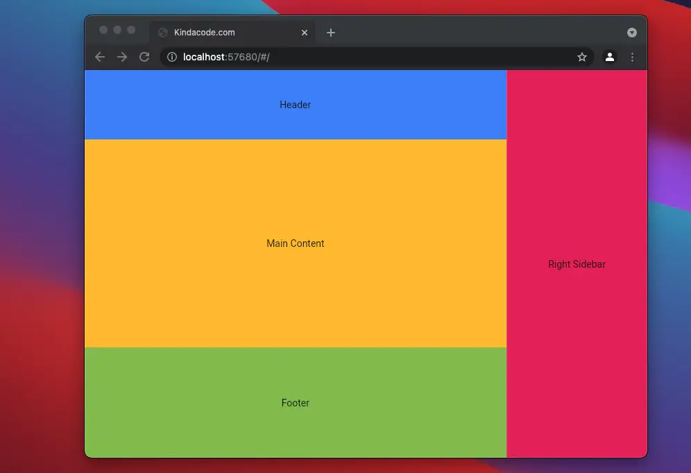
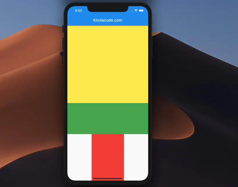
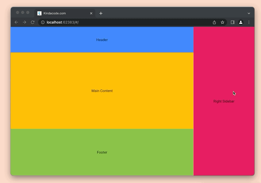
Let’s say we want to make a cross-platform app that can run on the web, desktops, tablets, and mobile phones. When the screen size is large, we will display the sidebar on the right side. When the screen is small, we will not display the sidebar.
App Preview
The full code:
import 'package:flutter/material.dart';

void main() {
  runApp(const MyApp());
}

class MyApp extends StatelessWidget {
  const MyApp({Key? key}) : super(key: key);

  @override
  Widget build(BuildContext context) {
    return const MaterialApp(
      // Remove the debug banner
      debugShowCheckedModeBanner: false,
      title: "Kindacode.com",
      home: HomePage(),
    );
  }
}

class HomePage extends StatelessWidget {
  const HomePage({Key? key}) : super(key: key);

  @override
  Widget build(BuildContext context) {
    return Scaffold(body: LayoutBuilder(builder: (context, constraints) {
      // Large screens (tablet on landscape mode, desktop, TV)
      if (constraints.maxWidth > 600) {
        return Row(
          children: [
            Column(
              children: [
                Container(
                  height: 100,
                  width: constraints.maxWidth * 0.75,
                  color: Colors.blueAccent,
                  child: const Center(
                    child: Text('Header'),
                  ),
                ),
                Container(
                  height: 300,
                  width: constraints.maxWidth * 0.75,
                  color: Colors.amber,
                  child: const Center(
                    child: Text('Main Content'),
                  ),
                ),
                Container(
                  height: constraints.maxHeight - 400,
                  width: constraints.maxWidth * 0.75,
                  color: Colors.lightGreen,
                  child: const Center(
                    child: Text('Footer'),
                  ),
                ),
              ],
            ),
            Container(
              width: constraints.maxWidth * 0.25,
              height: constraints.maxHeight,
              color: Colors.pink,
              child: const Center(
                child: Text('Right Sidebar'),
              ),
            ),
          ],
        );
      }

      // Samll screens
      return Column(
        children: [
          Container(
            height: 100,
            color: Colors.blue,
            child: const Center(
              child: Text('Header'),
            ),
          ),
          Container(
            height: 300,
            color: Colors.amber,
            child: const Center(
              child: Text('Main Content'),
            ),
          ),
          Container(
            height: constraints.maxHeight - 400,
            color: Colors.lightGreen,
            child: const Center(
              child: Text('Footer'),
            ),
          )
        ],
      );
    }));
  }
}Note: You can clean the code on your own by reducing the duplicates (the header, main content, and footer sections can be reusable).
Conclusion
You’ve learned the fundamentals of the LayoutBuilder widget and walked through a few examples of using it. If you’d like to explore more new and interesting things in Flutter, take a look at the following articles:
- How to Programmatically Take Screenshots in Flutter
- Using NavigationRail and BottomNavigationBar in Flutter
- Flutter + Firebase Storage: Upload, Retrieve, and Delete files
- Using GetX (Get) for Navigation and Routing in Flutter
- Using GetX (Get) for State Management in Flutter
- Flutter and Firestore Database: CRUD example (null safety)
You can also take a tour around our Flutter topic page, or Dart topic page for the latest tutorials and examples.


