


If your app has many screens with different app bars, using themes will bring many benefits such as: reducing the amount of code to write, and increasing the consistency of the appearance of the app.
In Flutter, we can implement a theme for app bars using the AppBarTheme class. You can set app-wide styles for app bar elements such as background color, font color, title color, icon color, etc. It is totally fine If you want to override a few things for a specific app bar (we’ll do this in the example below).
Table of Contents
Overview
Constructor:
AppBarTheme({
  Color? color,
  Color? backgroundColor,
  Color? foregroundColor,
  double? elevation,
  Color? shadowColor,
  ShapeBorder? shape,
  IconThemeData? iconTheme,
  IconThemeData? actionsIconTheme,
  bool? centerTitle,
  double? titleSpacing,
  double? toolbarHeight,
  TextStyle? toolbarTextStyle,
  TextStyle? titleTextStyle,
  SystemUiOverlayStyle? systemOverlayStyle,
})
Most settings will be automatically applied but with titleTextStyle, you have to add it to each screen like this:
AppBar(
        title: Text(
          'Kindacode.com',
          // You need to add this line
          style: Theme.of(context).appBarTheme.titleTextStyle,
        ),
),
For more clarity, let’s see the following example.
Example
App Preview
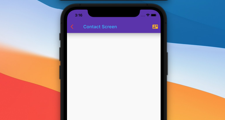
The app we are going to build has three screens (HomePage, AboutPage, ContactPage) associated with three app bars.
All of the app bars will have a deep purple background and amber action buttons according to the appBarTheme. The back buttons in AboutPage and ContactPage are red. The titles in HomePage and ContactPage are light blue and aligned to the left. As for the title in AboutPage, it is overwritten to white and aligned center.
The demo:
The Code
Here’s the complete code with explanations:
// main.dart
import 'package:flutter/material.dart';

void main() {
  runApp(const MyApp());
}

class MyApp extends StatelessWidget {
  const MyApp({Key? key}) : super(key: key);

  @override
  Widget build(BuildContext context) {
    return MaterialApp(
      // Remove the debug banner
      debugShowCheckedModeBanner: false,
      title: 'Kindacode.com',
      theme: ThemeData(
          primarySwatch: Colors.pink,
          appBarTheme: const AppBarTheme(
              backgroundColor: Colors.deepPurple,
              // This will be applied to the "back" icon
              iconTheme: IconThemeData(color: Colors.red),
              // This will be applied to the action icon buttons that locates on the right side
              actionsIconTheme: IconThemeData(color: Colors.amber),
              centerTitle: false,
              elevation: 15,
              titleTextStyle: TextStyle(color: Colors.lightBlueAccent))),
      home: const HomePage(),
    );
  }
}

// Home Screen
class HomePage extends StatelessWidget {
  const HomePage({Key? key}) : super(key: key);

  @override
  Widget build(BuildContext context) {
    return Scaffold(
      appBar: AppBar(
        title: Text(
          'Kindacode.com',
          style: Theme.of(context).appBarTheme.titleTextStyle,
        ),
        actions: [
          IconButton(
            icon: const Icon(Icons.home),
            onPressed: () {},
          )
        ],
      ),
      body: Center(
        child: ElevatedButton(
            child: const Text(
              'Go To About Screen',
            ),
            onPressed: () {
              Navigator.push(context,
                  MaterialPageRoute(builder: (context) => const AboutPage()));
            }),
      ),
    );
  }
}

// About Screen
class AboutPage extends StatelessWidget {
  const AboutPage({Key? key}) : super(key: key);

  @override
  Widget build(BuildContext context) {
    return Scaffold(
      appBar: AppBar(
        // Override the global settings
        title: Text(
          'About Screen',
          style: Theme.of(context)
              .appBarTheme
              .titleTextStyle
              ?.copyWith(color: Colors.white),
        ),
        centerTitle: true,
        actions: [IconButton(icon: const Icon(Icons.info), onPressed: () {})],
      ),
      body: Center(
        child: ElevatedButton(
            child: const Text('Go to Contact screen'),
            onPressed: () {
              Navigator.push(context,
                  MaterialPageRoute(builder: (context) => const ContactPage()));
            }),
      ),
    );
  }
}

// Contact Screen
class ContactPage extends StatelessWidget {
  const ContactPage({Key? key}) : super(key: key);

  @override
  Widget build(BuildContext context) {
    return Scaffold(
      appBar: AppBar(
        title: Text(
          'Contact Screen',
          style: Theme.of(context).appBarTheme.titleTextStyle,
        ),
        actions: [
          IconButton(icon: const Icon(Icons.contact_mail), onPressed: () {})
        ],
      ),
      body: const Center(
        child: Text('Contact Screen'),
      ),
    );
  }
}
For simplicity’s sake, I put all of the screens in a single file. However, to keep things organized, you should place each screen in a single file.
Note: All AppBarTheme properties are null by default. When null, the AppBar computes its own default values, typically based on the overall theme’s ThemeData.colorScheme, ThemeData.textTheme, and ThemeData.iconTheme. (for example, the background color is from primaryColor or primarySwatch). You can find more information in the official docs.
Conclusion
We’ve gone over the fundamentals of applying a theme for app bars in Flutter. This will help your app have a high degree of consistency, increasing your brand awareness and identity. If you’d like to explore more new and fascinating stuff about mobile development, take a look at the following articles:
- Flutter: Dynamic Text Color Based on Background Brightness
- Using GetX (Get) for State Management in Flutter
- Ways to Store Data Offline in Flutter
- Using Image Picker and Camera in React Native (Expo)
- Flutter SliverAppBar Example (with Explanations)
- Flutter: Get the Width & Height of a Network Image
You can also take a tour around our Flutter topic page, or Dart topic page for the latest tutorials and examples.