


In web and mobile applications, a number stepper input is a user interface control that allows users to increase or decrease a numerical value using plus (+) and minus (-) buttons. The current value is displayed between the buttons. In some cases, the stepper control may be customized to allow users to specify a step size or range of allowable values.
At the time of writing, Flutter doesn’t provide a built-in number stepper widget. So, this article will show you how to create a custom number stepper from scratch without using any third-party packages. Our custom number stepper can be implemented in many ways, such as we can put it next to other widgets, in a modal dialog, a bottom sheet, etc.
Creating NumberStepper Widget
We will create a reusable widget named NumberStepper. The required parameters are initialValue, minValue, maxValue, step, and onChanged (the callback function that passes the selected value to the parent of the NumberStepper widget):
// kindacode.com
class NumberStepper extends StatefulWidget {
  // the initial value
  final int initialValue;
  // the min value
  final int minValue;
  // the max value
  final int maxValue;
  // the step value
  final int step;
  // the callback
  final Function(int) onChanged;

  const NumberStepper({
    super.key,
    required this.initialValue,
    required this.minValue,
    required this.maxValue,
    required this.step,
    required this.onChanged,
  });

  @override
  State<NumberStepper> createState() => _NumberStepperState();
}

class _NumberStepperState extends State<NumberStepper> {
  int _currentValue = 0;

  @override
  void initState() {
    super.initState();
    // Set the initial value when the widget is created
    _currentValue = widget.initialValue;
  }

  @override
  Widget build(BuildContext context) {
    return Row(
      mainAxisAlignment: MainAxisAlignment.spaceAround,
      children: [
        // The "-" button
        IconButton(
          icon: const Icon(Icons.remove),
          onPressed: () {
            setState(() {
              if (_currentValue > widget.minValue) {
                _currentValue -= widget.step;
              }
            });

            // Call the callback
            widget.onChanged(_currentValue);
          },
        ),
        // The current value
        Text(
          _currentValue.toString(),
          style: const TextStyle(fontSize: 30),
        ),
        // The "+" button
        IconButton(
          icon: const Icon(Icons.add),
          onPressed: () {
            setState(() {
              if (_currentValue < widget.maxValue) {
                _currentValue += widget.step;
              }

              // Call the callback
              widget.onChanged(_currentValue);
            });
          },
        ),
      ],
    );
  }
}
You can also set the width, height, and background color for our number stepper widget by wrapping it inside a Container widget.
Now, it’s time to see a complete and working example.
Full Example
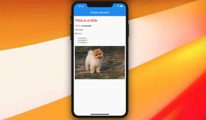
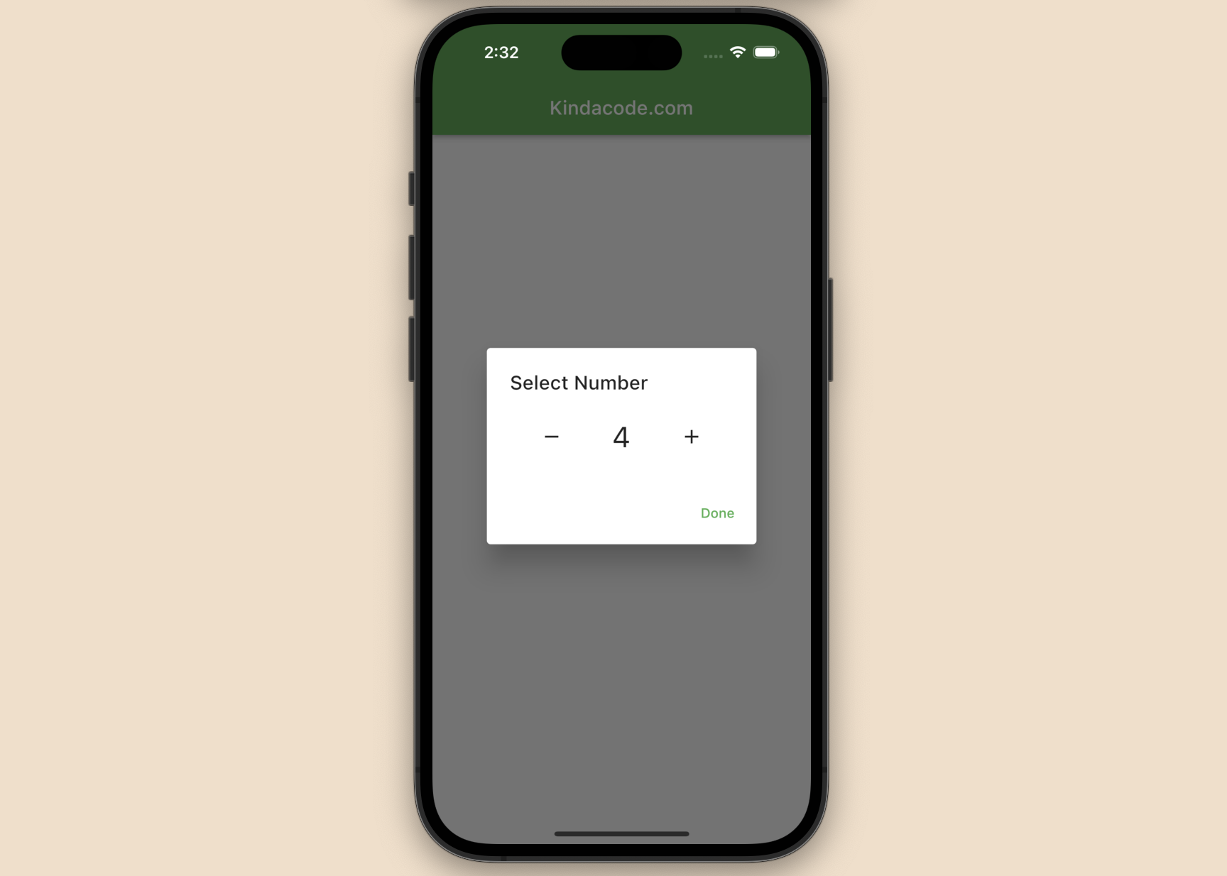
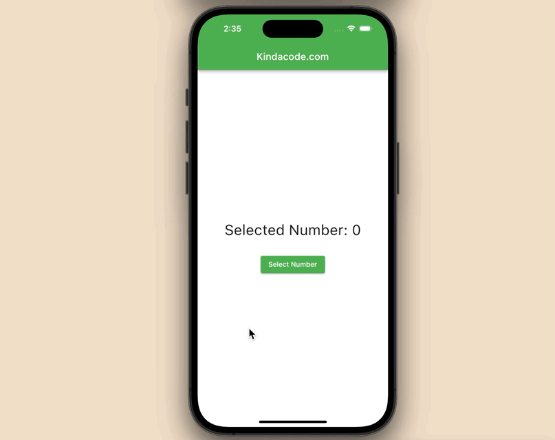
App Preview
The small app we’re going to make displays a Text widget and a button. When the button gets pressed, a dialog with our custom stepper input will show up, and the user can select a number right here. The selected number will be shown on the screen.
Here’s how it works:
The Code
To make it easy for you to execute this code on your computer, it’s good to put everything (including the code for the NumberStepper widget) in a single place (the main.dart file). Along with that are brief explanations interspersed between lines of code.
The full source code:
// Kindacode.com
// main.dart
import 'package:flutter/material.dart';

void main() {
  runApp(const MyApp());
}

class MyApp extends StatelessWidget {
  const MyApp({super.key});

  @override
  Widget build(BuildContext context) {
    return MaterialApp(
      // Remove the debug banner
      debugShowCheckedModeBanner: false,
      title: 'KindaCode.com',
      theme: ThemeData(
        primarySwatch: Colors.green,
      ),
      home: const KindaCodeDemo(),
    );
  }
}

class KindaCodeDemo extends StatefulWidget {
  const KindaCodeDemo({super.key});

  @override
  State<KindaCodeDemo> createState() => _KindaCodeDemoState();
}

class _KindaCodeDemoState extends State<KindaCodeDemo> {
  int _selectedNumber = 0;

  @override
  Widget build(BuildContext context) {
    return Scaffold(
      appBar: AppBar(title: const Text('Kindacode.com')),
      body: Center(
        child: Column(
          mainAxisAlignment: MainAxisAlignment.center,
          children: [
            Text(
              'Selected Number: $_selectedNumber',
              style: const TextStyle(fontSize: 30),
            ),
            const SizedBox(height: 30),
            // Show the dialog when the button is pressed
            ElevatedButton(
                onPressed: () {
                  showDialog(
                    context: context,
                    builder: (_) => AlertDialog(
                      title: const Text('Select Number'),
                      // We implement the custom number stepper widget here
                      content: NumberStepper(
                        initialValue: _selectedNumber,
                        minValue: 0,
                        maxValue: 100,
                        step: 1,
                        // Set the onChanged callback
                        onChanged: (value) {
                          setState(() {
                            _selectedNumber = value;
                          });
                        },
                      ),
                      actions: [
                        TextButton(
                          onPressed: () {
                            Navigator.of(context).pop();
                          },
                          child: const Text('Done'),
                        ),
                      ],
                    ),
                  );
                },
                child: const Text('Select Number')),
          ],
        ),
      ),
    );
  }
}

// The custom number stepper widget
class NumberStepper extends StatefulWidget {
  // the initial value
  final int initialValue;
  // the min value
  final int minValue;
  // the max value
  final int maxValue;
  // the step value
  final int step;
  // the callback
  final Function(int) onChanged;

  const NumberStepper({
    super.key,
    required this.initialValue,
    required this.minValue,
    required this.maxValue,
    required this.step,
    required this.onChanged,
  });

  @override
  State<NumberStepper> createState() => _NumberStepperState();
}

class _NumberStepperState extends State<NumberStepper> {
  int _currentValue = 0;

  @override
  void initState() {
    super.initState();
    // Set the initial value when
    _currentValue = widget.initialValue;
  }

  @override
  Widget build(BuildContext context) {
    return Row(
      mainAxisAlignment: MainAxisAlignment.spaceAround,
      children: [
        // The "-" button
        IconButton(
          icon: const Icon(Icons.remove),
          onPressed: () {
            setState(() {
              if (_currentValue > widget.minValue) {
                _currentValue -= widget.step;
              }
            });

            // Call the callback
            widget.onChanged(_currentValue);
          },
        ),
        // The current value
        Text(
          _currentValue.toString(),
          style: const TextStyle(fontSize: 30),
        ),
        // The "+" button
        IconButton(
          icon: const Icon(Icons.add),
          onPressed: () {
            setState(() {
              if (_currentValue < widget.maxValue) {
                _currentValue += widget.step;
              }

              // Call the callback
              widget.onChanged(_currentValue);
            });
          },
        ),
      ],
    );
  }
}
See also: Using Stepper widget in Flutter – Tutorial & Example
Conclusion
You’ve learned how to make a custom number stepper from scratch in Flutter. From this point, you can improve it as needed. If you’d like to explore more new and interesting stuff in the planet of modern Flutter, take a look at the following articles:
- How to Create a Countdown Timer in Flutter
- How to Create a Stopwatch in Flutter
- Flutter: Get the Position of a Tap (X & Y coordinates)
- Creating Masonry Layout in Flutter with Staggered Grid View
- How to Create a Sortable ListView in Flutter
- 2 Ways to Create Typewriter Effects in Flutter
You can also tour around our Flutter topic page or Dart topic page for the most recent tutorials and examples.


