


This article is about the BottomAppBar widget in Flutter. We’ll cover the fundamentals and walk through a couple of examples (from basics to advanced) of implementing and customizing the widget in practice (note that we’ll use the latest version of Flutter with useMaterial3 enabled by default).
A Quick Overview
To implement a bottom app bar, we assign the bottomNavigationBar property of Scaffold to a BottomAppBar widget with some handy options, as follows:
Scaffold(
        bottomNavigationBar: BottomAppBar(
          color: /* Background color */,
          elevation: /* Elevation */,
          shape: /* Configure a notch */,
          child: /* Child widget here, usually a Row widget */,
        ),
        /* ... */
);
In case you want to add a bottom tab instead of a bottom app bar, see the following articles:
- Working with Cupertino Bottom Tab Bar in Flutter
- Using NavigationRail and BottomNavigationBar in Flutter
- Flutter: Show/Hide text labels of BottomNavigationBar items
- Flutter: BottomNavigationBar example
Now it’s time to see some practical examples.
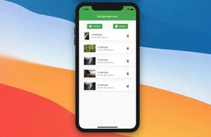
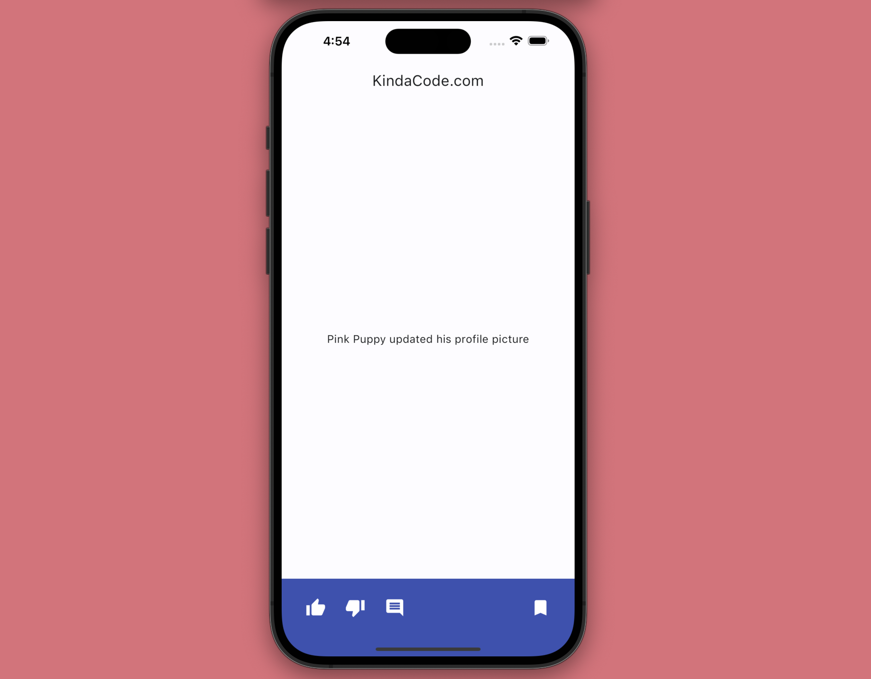
Simple BottomAppBar
This example creates a typical bottom app bar that contains a row of icon buttons: like, dislike, comment, and bookmark. This kind of bottom app bar can be found on many social media platforms, where a user can interact with posts, photos, videos, etc.
Screenshot:
The code:
// main.dart
import 'package:flutter/material.dart';
void main() {
runApp(const MyApp());
}
class MyApp extends StatelessWidget {
const MyApp({Key? key}) : super(key: key);
@override
Widget build(BuildContext context) {
return MaterialApp(
// Remove the debug banner
debugShowCheckedModeBanner: false,
title: 'KindaCode.com',
theme: ThemeData(
colorScheme: ColorScheme.fromSeed(seedColor: Colors.blue),
useMaterial3: true,
),
home: const HomeScreen(),
);
}
}
class HomeScreen extends StatelessWidget {
const HomeScreen({Key? key}) : super(key: key);
@override
Widget build(BuildContext context) {
return Scaffold(
appBar: AppBar(title: const Text('KindaCode.com')),
body: const Center(
child: Text(
'Pink Puppy updated his profile picture',
style: TextStyle(fontSize: 16),
),
),
// implement BottomAppBar
bottomNavigationBar: BottomAppBar(
color: Colors.indigo,
elevation: 6,
// BottomAppBar content
child: Padding(
padding: const EdgeInsets.only(top: 5, left: 10, right: 10),
child: Row(
children: [
// Like button
IconButton(
onPressed: () {
debugPrint("Like button pressed");
},
icon: const Icon(
Icons.thumb_up,
size: 30,
color: Colors.white,
)),
const SizedBox(
width: 10,
),
// Dislike button
IconButton(
onPressed: () {
debugPrint("Dislike button pressed");
},
icon: const Icon(
Icons.thumb_down,
size: 30,
color: Colors.white,
)),
const SizedBox(
width: 10,
),
// Comment button
IconButton(
onPressed: () {
debugPrint("Comment button pressed");
},
icon: const Icon(
Icons.comment,
size: 30,
color: Colors.white,
)),
// Bookmark/Save button
Expanded(
child: Row(
mainAxisAlignment: MainAxisAlignment.end,
children: [
IconButton(
onPressed: () {
debugPrint("Bookmark button pressed");
},
icon: const Icon(
Icons.bookmark,
size: 30,
color: Colors.white,
)),
],
),
)
],
),
),
));
}
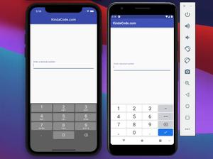
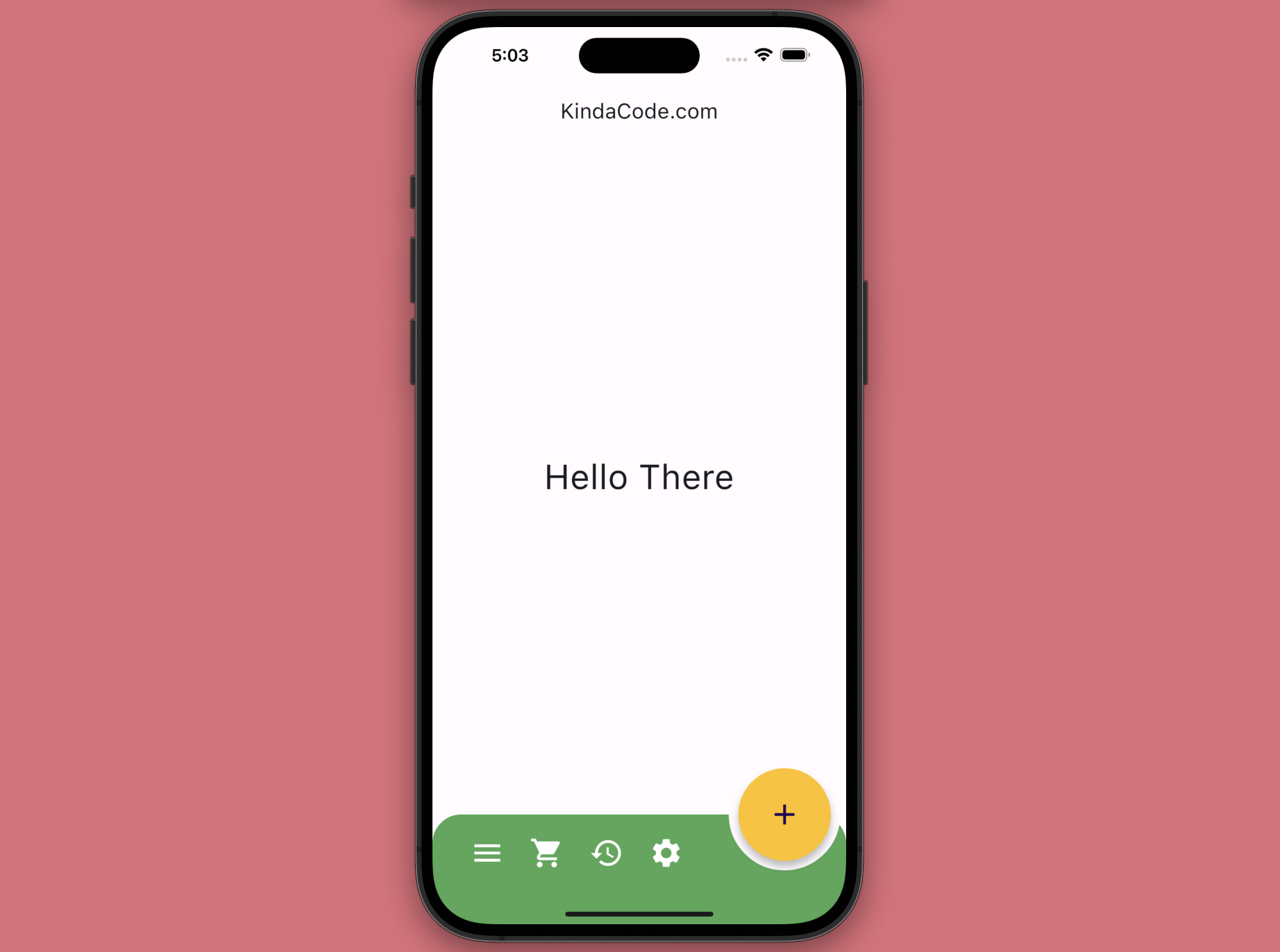
}Rounded BottomAppBar & FloatingActionButton
This example creates a rounded bottom app bar that has a notch where a floating action button resides.
Screenshot:
The complete code (with explanations):
// main.dart
import 'package:flutter/material.dart';

void main() {
  runApp(const MyApp());
}

class MyApp extends StatelessWidget {
  const MyApp({Key? key}) : super(key: key);

  @override
  Widget build(BuildContext context) {
    return MaterialApp(
      // Remove the debug banner
      debugShowCheckedModeBanner: false,
      title: 'KindaCode.com',
      theme: ThemeData(
        useMaterial3: true,
      ),
      home: const HomeScreen(),
    );
  }
}

class HomeScreen extends StatelessWidget {
  const HomeScreen({Key? key}) : super(key: key);
  @override
  Widget build(BuildContext context) {
    return Scaffold(
      appBar: AppBar(title: const Text('KindaCode.com')),
      body: const Center(
        child: Text(
          'Hello There',
          style: TextStyle(fontSize: 36),
        ),
      ),
      // implement BottomAppBar
      bottomNavigationBar: BottomAppBar(
        color: Colors.green,
        notchMargin: 10,
        // make rounded corners & create a notch for the floating action button
        shape: const AutomaticNotchedShape(
          RoundedRectangleBorder(
            borderRadius: BorderRadius.all(Radius.circular(30)),
          ),
          StadiumBorder(),
        ),
        child: IconTheme(
          data: const IconThemeData(color: Colors.white, size: 36),
          child: Padding(
            padding: const EdgeInsets.symmetric(horizontal: 15),
            child: Row(
              mainAxisAlignment: MainAxisAlignment.start,
              children: [
                IconButton(
                    onPressed: () {
                      debugPrint("Menu Pressed");
                    },
                    icon: const Icon(Icons.menu)),
                const SizedBox(
                  width: 10,
                ),
                IconButton(
                    onPressed: () {
                      debugPrint("Cart Pressed");
                    },
                    icon: const Icon(Icons.shopping_cart)),
                const SizedBox(
                  width: 10,
                ),
                IconButton(
                    onPressed: () {
                      debugPrint("History Pressed");
                    },
                    icon: const Icon(Icons.history)),
                const SizedBox(
                  width: 10,
                ),
                IconButton(
                    onPressed: () {
                      debugPrint("Settings Pressed");
                    },
                    icon: const Icon(Icons.settings)),
              ],
            ),
          ),
        ),
      ),
      // implement the big floating action button
      floatingActionButton: FloatingActionButton.large(
        onPressed: () {
          debugPrint("Floating Action Button Pressed");
        },
        backgroundColor: Colors.amber,
        shape: ShapeBorder.lerp(
          const CircleBorder(),
          const StadiumBorder(),
          0.5,
        ),
        child: const Icon(Icons.add),
      ),
      // position the floating action button
      floatingActionButtonLocation: FloatingActionButtonLocation.endDocked,
    );
  }
}
If you want to find more details about FloatingActionButton, see this article Flutter: Floating Action Button examples (basic & advanced).
Conclusion
We’ve covered the BottomAppBar widget’s fundamentals and a few practical examples of using it in real-world apps. You can modify the code to make them even better and suit your needs. Continue learning and strengthening your skills by taking a look at the following articles:
- Flutter: Rendering an Image from Byte Buffer/Int8List
- Flutter StatefulBuilder example
- Using Font Awesome Icons in Flutter
- Flutter: Programmatically Check Soft Keyboard Visibility
- Flutter: Make a “Scroll Back To Top” button
- Flutter and Firestore Database: CRUD example
You can also tour around our Flutter topic page or Dart topic page for the most recent tutorials and examples.