


This article shows you a couple of different ways to display a badge on the top right (or any position you like) of a widget in Flutter. The first way is to write your own code, and the second one is to use a third-party plugin.
Writing Code From Scratch
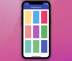
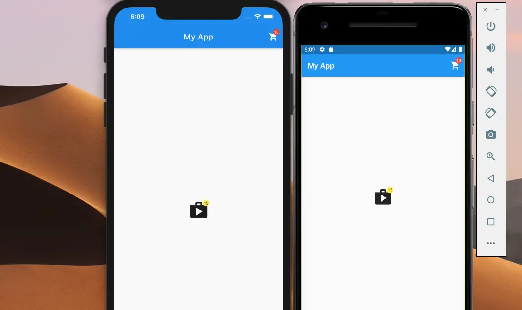
Example Preview
Screenshot on iOS and Android:
The Code
In the lib directory of your project, create a new file named my_badge.dart. This file contains a reusable widget called MyBadge:
// my_badge.dart
import 'package:flutter/material.dart';

class MyBadge extends StatelessWidget {
  final double top;
  final double right;
  final Widget child; // our badge widget will wrap this child widget
  final String value; // what displays inside the badge
  final Color color; // the  background color of the badge - default is red

  const MyBadge(
      {Key? key,
      required this.child,
      required this.value,
      this.color = Colors.red,
      required this.top,
      required this.right})
      : super(key: key);

  @override
  Widget build(BuildContext context) {
    return Stack(
      alignment: Alignment.center,
      children: [
        child,
        Positioned(
          right: right,
          top: top,
          child: Container(
            padding: const EdgeInsets.all(2.0),
            decoration: BoxDecoration(
              borderRadius: BorderRadius.circular(10.0),
              color: color,
            ),
            constraints: const BoxConstraints(
              minWidth: 16,
              minHeight: 16,
            ),
            child: Text(
              value,
              textAlign: TextAlign.center,
              style: const TextStyle(
                fontSize: 10,
              ),
            ),
          ),
        )
      ],
    );
  }
}
Now you can use the MyBadge widget anywhere, anytime you want:
// main.dart
import 'package:flutter/material.dart';
import './my_badge.dart';

void main() {
  runApp(const MyApp());
}

class MyApp extends StatelessWidget {
  const MyApp({Key? key}) : super(key: key);

  @override
  Widget build(BuildContext context) {
    return const MaterialApp(
      // Remove the DEBUG banner
      debugShowCheckedModeBanner: false,
      title: 'KindaCode.com',
      home: HomeScreen(),
    );
  }
}

class HomeScreen extends StatelessWidget {
  const HomeScreen({Key? key}) : super(key: key);

  @override
  Widget build(BuildContext context) {
    return Scaffold(
      appBar: AppBar(
        title: const Text('My App'),
        actions: [
          MyBadge(
              top: 8,
              right: 8,
              value: "10",
              child: IconButton(
                  icon: const Icon(Icons.shopping_cart), onPressed: () {}))
        ],
      ),
      body: const Center(
        child: MyBadge(
          value: "15",
          top: -1,
          right: -1,
          color: Colors.yellow,
          child: Icon(
            Icons.shop,
            size: 50,
          ),
        ),
      ),
    );
  }
}
Our badges look nice. However, if you like to get the job done quickly and have more advanced options, it’s a good idea to make use of a package.
Using a third-party Plugin
The plugin we’ll use named badges. To install it, add badges and its latest version to the dependencies block in your pubspec.yaml file by executing the following command:
flutter pub add badgesAfter that, run:
flutter pub get Import to your dart code:
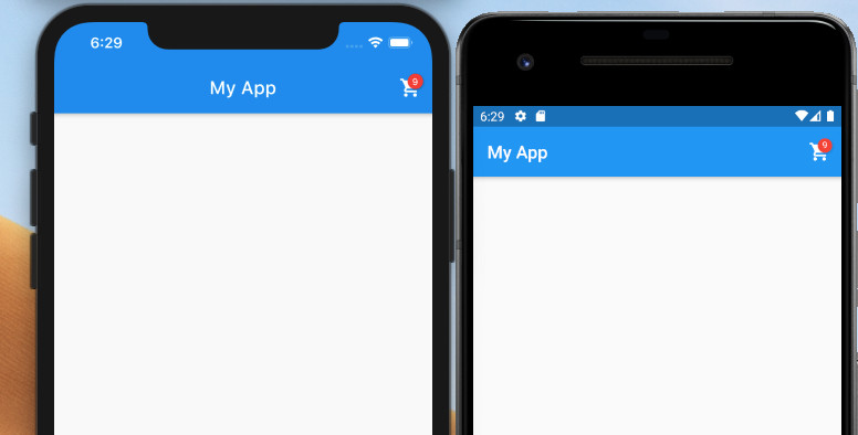
import 'package:badges/badges.dart';Example
AppBar(
        title: const Text('My App'),
        actions: [
          Badge(
              position: BadgePosition.topEnd(top: 10, end: 10),
              badgeContent: const Text(
                '9',
                style: TextStyle(color: Colors.white, fontSize: 10),
              ),
              child: IconButton(
                  icon: const Icon(Icons.shopping_cart), onPressed: () {}))
        ],
),
Screenshot:
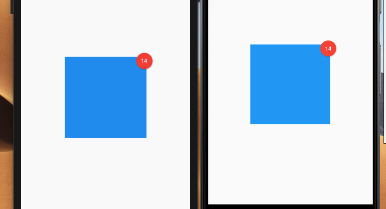
Another Example
Center(
        child: Badge(
          position: BadgePosition.topEnd(top: -10, end: -15),
          badgeColor: Colors.red,
          badgeContent: Container(
            width: 30,
            height: 30,
            alignment: Alignment.center,
            child: const Text(
              '14',
              style: TextStyle(color: Colors.white),
            ),
          ),
          child: Container(
            width: 200,
            height: 200,
            color: Colors.blue,
          ),
        ),
),
Screenshot:
Wrapping Up
We’ve explored more than one technique to implement badges in Flutter. This knowledge is very helpful in many scenarios, for example, indicating that there are some unread messages or some new notifications or the like. Flutter is amazing, and there are a lot of things to learn. Keep the ball rolling and continue moving forward by taking a look at the following articles:
- Flutter: Making Beautiful Chat Bubbles (2 Approaches)
- Flutter: Creating OTP/PIN Input Fields (2 approaches)
- Write a simple BMI Calculator with Flutter (Null Safety)
- Create a Custom NumPad (Number Keyboard) in Flutter
- 2 Ways to Add Multiple Floating Buttons in Flutter
- Flutter: Creating a Custom Number Stepper Input
You can also check out our Flutter category page or Dart category page for the latest tutorials and examples.